Why Earth Tones are Replacing All-White Interiors in 2026
Why Earth Tones are Replacing All-white Interiors in 2026
Hey there, makers! 👋 You know that feeling when you scroll through Pinterest or Instagram and every single living room looks… the same? Like a perfectly curated, slightly sterile white box? I’ve been there, admiring the clean lines, but also feeling a little tired of it all.
It’s like we collectively decided that "minimalist" meant "bleached." For a while, it felt fresh, right? But lately, I’ve noticed a shift, and it’s something I’m genuinely excited about: earth tones are making a huge comeback, and I think they’re here to stay past 2026.
Today, we’re going to dig into why this shift is happening, what exactly "earth tones" mean beyond just brown and beige, and how you can bring these cozy, natural vibes into your own space. Trust me, it’s easier than you think, and you don’t need a huge budget to do it.
Why This Actually Matters
You might be thinking, "Laura, it's just colors, right?" But I truly believe our homes should feel like a reflection of us, a place that nurtures creativity and calm. An all-white space can sometimes feel unapproachable, like you can't really live in it without worrying about every smudge or spill.
This isn't just about aesthetics; it's about comfort and connection. Moving away from stark white allows us to create spaces that feel more lived-in, more personal, and deeply relaxing. It's like your home can finally take a deep breath.
I remember when I first moved into my little Portland bungalow back in 2019, I tried to go for that bright, airy white look. Within a year, my living room felt cold, and honestly, a little boring. It wasn't until I found a beautiful, deep olive green throw blanket at a thrift store for $8 that something clicked. That one piece made the whole room feel instantly warmer, more inviting, and just… me.
Finding Your Palette: What Even are Earth Tones?
When I say "earth tones," your mind might jump straight to beige walls and brown sofas, and if that’s the case, I totally get why you might be hesitant. But earth tones are so much richer and more varied than just that! Think about the colors you see when you go for a hike or spend time in a garden.
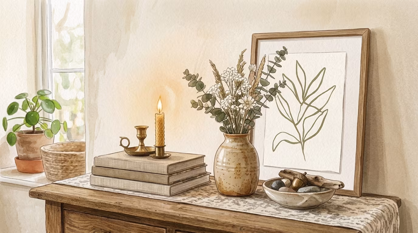
We’re talking about a spectrum inspired directly by nature. From the deep greens of a forest to the dusty pinks of a desert sunset, the terracotta of sun-baked clay, and the serene blues of a mountain lake. It’s about bringing those organic, grounding colors indoors.
More Than Just Brown: a Spectrum of Warmth
These tones evoke a sense of calm and stability, and they pair beautifully together because, well, they already exist together in the natural world. It’s about creating harmony and warmth without being dull.
- Warm Greys & Taupes - These aren't your cold, stark greys. Think greys with a hint of brown or beige, like a smooth river stone. They’re incredibly versatile and act as a sophisticated neutral base, grounding a space without making it feel heavy. I’ve seen them used beautifully on walls to make brighter art really pop, or even in larger furniture pieces that you want to feel substantial but not overwhelming.
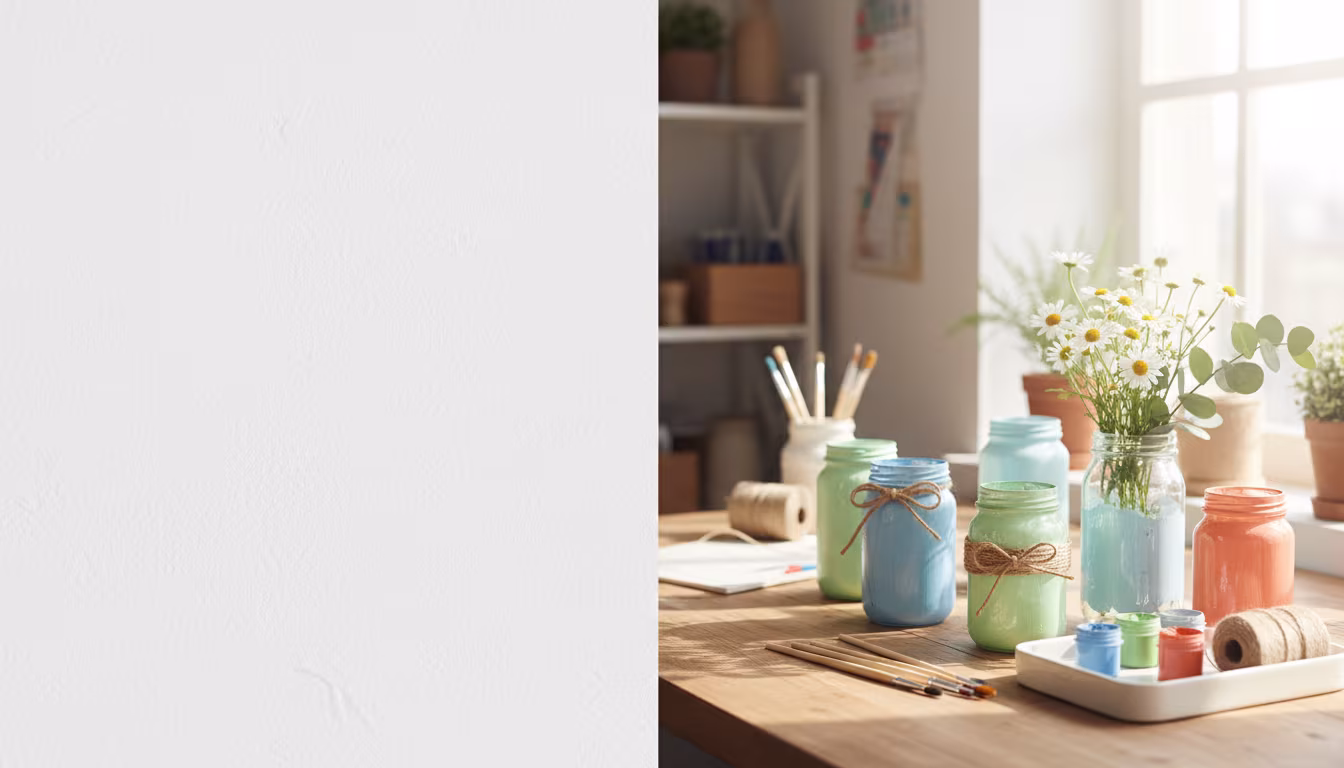
- Terracottas & Rusts - Imagine the warmth of a sunset or the rich color of clay pots. These burnt oranges and deep reds bring an incredible energy and coziness. They're perfect for adding a pop of warmth in smaller accents like pillows, pottery, or even a statement armchair. I picked up a terracotta planter at a yard sale for $5 last spring, and it instantly made my plant corner feel more vibrant and earthy.
- Forest Greens & Olives - These are my absolute favorites right now. From the deep, moody greens of an old-growth forest to the softer, muted tones of olive branches, they instantly bring a sense of tranquility and life indoors. They pair wonderfully with natural wood and are fantastic for accent walls, larger textiles like rugs, or even painted thrift store furniture. My latest project involved painting an old wooden chest a deep forest green, and it totally transformed it.
- Dusty Blues & Sages - Think of the soft blue of a misty morning or the muted green of dried sage. These tones are incredibly serene and calming. They offer a cool contrast to the warmer earth tones but still maintain that natural, grounded feeling. They’re fantastic for bedrooms or bathrooms where you want to create a spa-like, relaxing atmosphere. A dusty blue throw on a couch full of warm browns and creams creates such a soothing balance.
- Deep Mustards & Ochres - These golden, sun-baked yellows add a surprising amount of richness and warmth without being overpowering. They often have an antique or vintage feel, especially when paired with natural wood or muted greens. I used a mustard-yellow ceramic vase I found at a flea market for $10, and it brings a cheerful, grounded glow to my bookshelf, especially when the light hits it. They’re excellent for adding small, vibrant touches that don't scream for attention but quietly add depth.
- Muted Pinks & Clay Tones - These aren't the bright, sugary pinks you might associate with nurseries. Think of the subtle blush of sandstone or the soft, faded rose of dried flowers. These gentle, earthy pinks are wonderfully sophisticated and create a feeling of soft warmth. They blend beautifully with greys, greens, and natural wood, offering a delicate touch that’s far from saccharine. I've seen beautiful textiles in these colors that add a really refined, organic feel to a room.
- Rich Browns & Chocolates - Of course, we can’t forget the classics! These aren’t the drab browns of decades past. Think of the deep, varied tones of hardwood floors, natural leather, or the rich soil in a garden. Used strategically, they provide depth and a grounding anchor to any space. A well-loved leather armchair or a solid wood coffee table in these rich brown tones brings an instant feeling of history and permanence.
The beauty of these colors is how they interact, creating a harmonious palette that feels cohesive because it’s inspired by the world around us. You don’t have to pick just one; mixing them is where the magic happens!
Bringing the Outside In: How to Actually do It
Okay, so you’re ready to ditch the all-white and invite some warmth in, but where do you even start? It can feel a little overwhelming to imagine changing your whole aesthetic. Don’t worry, you don’t have to repaint every wall tomorrow!
The best part about adopting earth tones is that you can start incredibly small. Even one or two intentional changes can make a huge difference in how a room feels. I've found that patience and observation are key here.
Step 1: Start with Textiles & Textures
This is probably the easiest and most budget-friendly way to introduce earth tones. Think about rugs, throw blankets, pillows, and even curtains. Swapping out a few bright white pillows for ones in a deep sage green or a warm rust can instantly change the mood of your living room.
I recently bought a beautiful wool throw in a rich mustard yellow for about $20 at a local vintage market. It completely transformed my plain beige sofa, giving it personality and a cozy, lived-in feel. It’s a low-commitment way to test out colors you might be hesitant to paint on a wall.
Step 2: Embrace Natural Materials
Earth tones really sing when paired with actual natural materials. Look for wood, wicker, rattan, stone, and ceramic pottery. These materials inherently carry the warmth and texture of the outdoors.
Thrift stores are treasure troves for these kinds of items! I’ve found countless ceramic vases, wooden bowls, and rattan baskets for a few dollars each. These aren’t just decorative; they add an authentic, grounding element that connects your space to nature. My collection of mismatched, earthy-toned ceramic mugs adds so much character to my open kitchen shelving.
Step 3: a Pop of Paint, Not a Whole Room
If you're ready for a bigger step but not quite ready to commit to painting an entire room, consider an accent wall or a painted piece of furniture. An accent wall in a deep forest green or a warm terracotta can be incredibly impactful without overwhelming the space.
Alternatively, find an old dresser or bookshelf at a yard sale – I got a solid wood nightstand for $15 – and paint it a lovely earthy shade. It's a fantastic DIY project that allows you to bring in a bolder color in a controlled way. Plus, seeing your finished piece will give you so much confidence for future projects!
Step 4: Greenery, Obviously!
This might seem obvious, but plants are the ultimate earth tone accessory! They bring actual living green into your home, adding freshness, texture, and a sense of calm. You don't need a green thumb to start.
Even a few low-maintenance options like snake plants, ZZ plants, or pothos can make a huge difference. For those of us with less-than-stellar plant parent skills (that's me sometimes!), dried botanicals like pampas grass or eucalyptus branches also work wonders for adding natural texture and muted tones.
Step 5: Lighting for Warmth
The type of light in your home dramatically affects how colors appear. Swap out harsh, cool-toned LED bulbs for warmer, softer light. Look for bulbs in the 2700K to 3000K range. This subtle change can instantly make your earth tones feel richer and your whole room feel cozier and more inviting.
Also, consider lamps with natural shades made from linen, rattan, or woven materials. The diffused, warm light they cast enhances the organic feel of an earth-toned space. My living room has three different lamps, all with warm bulbs and linen shades, and it makes such a difference in the evening.
Step 6: Thrifted Treasures with Character
One of my favorite ways to incorporate earth tones is through unique, thrifted decor. Look for vintage landscape paintings with muted color palettes, ceramic pitchers, old wooden boxes, or even interesting rocks and shells. These items often come in natural, faded hues that perfectly fit the earth tone aesthetic.
Each piece tells a story, which adds so much more personality than mass-produced decor. I recently found a set of four small landscape paintings, all in slightly muted greens and browns, for $12 at an antique mall. Arranging them together instantly created a gallery wall with depth and character.
Step 7: Mix and Match, Don't Matchy-matchy
The beauty of nature is its imperfect harmony, and your home should reflect that. Don't feel like everything has to be the exact same shade or style. Mix textures – a chunky knit throw with a smooth ceramic vase, a rough-hewn wooden table with soft linen napkins.
Combine different shades within the earth tone family. A deep forest green can look stunning next to a dusty rose or a warm grey. This layering creates depth and interest, making your space feel authentic and truly lived-in, rather than like a page out of a furniture catalogue.
Step 8: Consider Your Floors
Your flooring is a huge canvas, and it plays a significant role in the overall feel of a room. If you have light-colored carpet or tiles, consider adding a large area rug in an earth-toned pattern. Jute, sisal, or wool rugs in natural colors like sand, beige, or muted greens are fantastic for grounding a space.
If you're lucky enough to have hardwood floors, those natural wood tones are already a perfect foundation for an earth-toned scheme. Embrace them! They bring instant warmth and a timeless appeal that no paint color can fully replicate.
Avoiding the Monotone Trap: Common Mistakes and How to Dodge Them
Okay, so we're moving away from sterile white, but we definitely don't want to end up in a drab, monotonous brown box either! The goal is warmth and richness, not dullness. It's easy to get a little lost when you're experimenting with new colors, and I’ve certainly made a few missteps along the way.
Here are some common pitfalls I’ve either fallen into myself or seen others struggle with, and how to steer clear of them.
Mistake 1: Too Much of One Color
Just like an all-white room can feel flat, an all-beige or all-brown room can quickly become boring. The key to successful earth tones is variety and layering. Don't feel like you need every single item in your room to be the same shade of green or terracotta.
Instead, pick one or two main colors, and then introduce lighter and darker shades of those, plus complementary colors from the earth tone family. For example, if you love olive green, pair it with light cream, warm grey, and a touch of rusty orange. This creates depth and visual interest.
Mistake 2: Ignoring Undertones
This is a subtle one, but it makes a huge difference! Every color has an undertone – it's either warm (yellow, red, orange base) or cool (blue, green, purple base). While earth tones are generally warm, you can still have cool-leaning greens or warm-leaning greys.
Mixing warm and cool undertones without intention can make a room feel chaotic or "off." Try to stick to one family of undertones in a single space, or use a neutral to bridge the gap. For example, if you're using a warm terracotta, pair it with a creamy off-white, not a stark cool white.
Mistake 3: Forgetting Texture
Color is important, but texture is what brings a room to life, especially with a muted palette. Flat, smooth surfaces everywhere can make a room feel uninviting. Imagine a room with only smooth painted walls and synthetic fabrics – it would lack soul.
Introduce a variety of textures: a chunky knit blanket, a woven jute rug, a smooth ceramic vase, rough linen curtains, a plush velvet pillow, and reclaimed wood furniture. These tactile elements add richness and make the space feel inviting and dynamic. My own living room feels so much cozier since I added a thick wool rug and some linen blend pillows.
Mistake 4: Overlooking Lighting
As I mentioned before, light can make or break your color choices. A beautiful sage green paint might look incredible in natural daylight, but under harsh, cool artificial light, it could turn into a dreary grey. Always test paint samples on your walls and observe them at different times of day and under different lighting conditions.
Ensure you have a mix of lighting sources – overhead, task, and accent lighting – all with warm-toned bulbs. This layering of light creates atmosphere and ensures your earth tones look their best around the clock.
Mistake 5: Rushing It
Redecorating, especially with a new color scheme, is a process, not a race. Don't feel pressured to completely transform your space overnight. Start with small, impactful changes. Live with them for a bit, see how they feel, and then add more layers. This approach allows your style to evolve organically and ensures you truly love the changes you're making.
Building a home that reflects you takes time and experimentation. It's okay if a pillow or a painted piece doesn't quite work out on the first try. That's part of the fun of being a maker!
Your home should feel like a well-loved story, not a showroom catalogue.
Frequently Asked Questions
Will My Small Space Feel Darker with Earth Tones?
Not necessarily! You can absolutely use earth tones in small spaces without making them feel cramped. The trick is to lean into lighter, airier earth tones like soft sages, dusty blues, warm greys, and creamy off-whites. Use deeper tones for accents rather than main wall colors, and make sure you have plenty of natural and warm artificial light.
I'm on a Budget. Where Should I Start?
Start with textiles and thrift store finds! A new throw blanket, some patterned pillows, or a vintage rug can change a room’s feel for under $50. Hunt for ceramic vases, wooden bowls, and unique artwork at thrift stores or yard sales. Painting a single piece of furniture you already own or found cheap is also super impactful and budget-friendly.
How do I Know Which Earth Tones Will Work Together?
The easiest way is to look to nature itself! Think about landscapes you love – a forest floor, a desert at sunset, a rocky coastline. What colors naturally appear together? Another trick is to pick one dominant earth tone you love, and then find complementary shades with similar undertones (warm with warm, cool with cool). You can also use online color palette generators, but honestly, trusting your gut after seeing inspiration from nature is often the best way.
What if I Still Love White? Can I Mix It?
Absolutely! White can be a fantastic companion to earth tones. Instead of an all-white room, think of white as a fresh, crisp accent or a clean backdrop. An off-white wall can provide a beautiful canvas for furniture and decor in deep greens, terracottas, and natural wood tones. White trim, white lampshades, or even a light white rug can offer a visual break and make the earth tones pop even more.
How Long does This Take to Redecorate a Room with Earth Tones?
It totally depends on how much you want to change! Small tweaks like adding new pillows, a throw, and a few thrifted pots can happen in an afternoon. If you're painting an accent wall and swapping out a rug, you're looking at a weekend project. A full room overhaul, including new furniture and multiple paint colors, could take several weeks of dedicated effort or be a gradual process over months. Remember, there's no rush to "finish" your home.
The Bottom Line
Moving away from the all-white trend isn’t just about aesthetics; it’s about creating a home that feels truly comforting, personal, and connected to the natural world. Earth tones invite warmth, character, and a sense of calm that many of us are craving after years of stark minimalism.
You don't need to be an interior designer or spend a fortune. Start small, experiment with textiles and thrift store finds, and trust your instincts. Your home should be your sanctuary, and inviting in these grounding colors is a wonderful way to make it feel more authentically you. Go on, give it a try! You might be surprised at how much you love the cozy vibes. ❤️
Related Posts
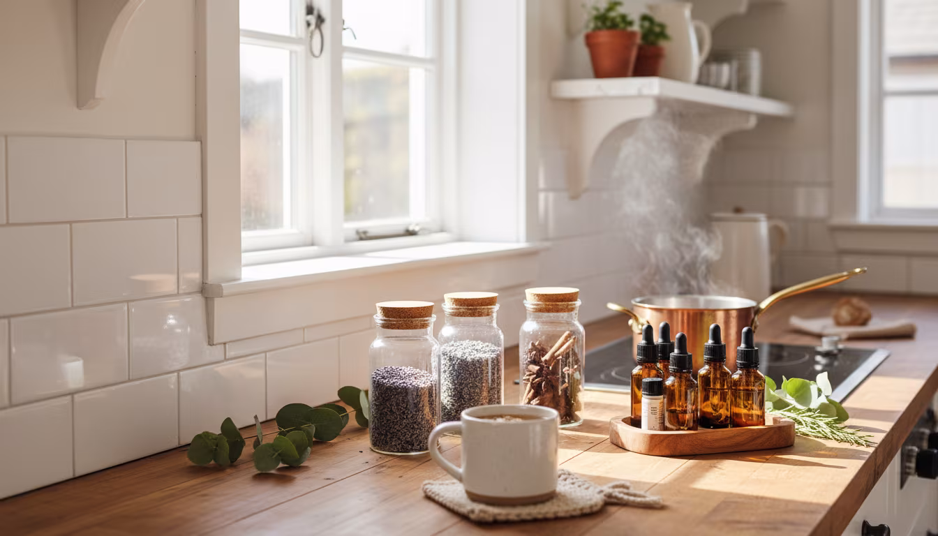
The Secret to Making Your Home Smell Amazing Without Artificial Sprays
Tired of chemical-laden air fresheners? Learn how to fill your home with beautiful, natural scent...
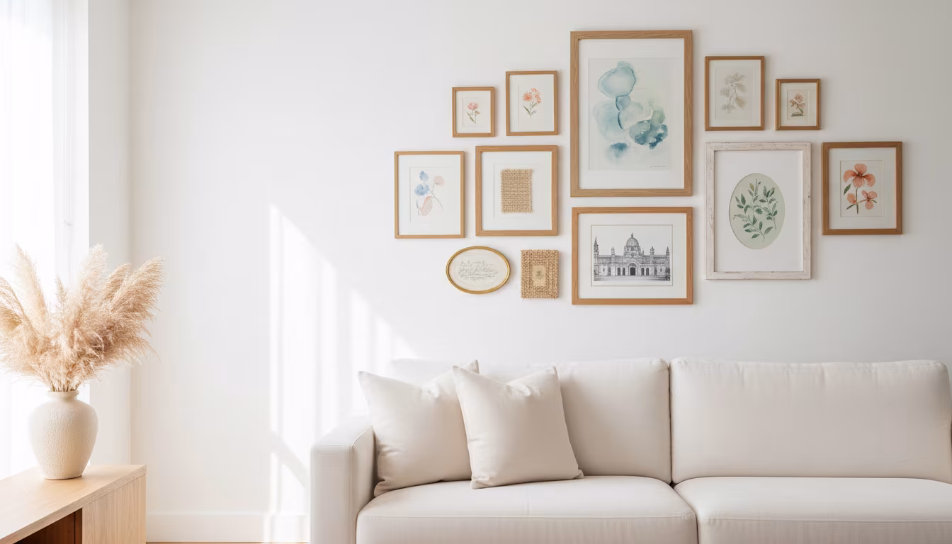
How to Arrange Art Above a Sofa Using the Right Proportions
Tired of staring at a blank wall above your couch? We'll show you exactly how to choose and arran...
How to Decorate a Rental Apartment Without Damaging Any Walls
Dreaming of a stylish rental pad but worried about losing your deposit? We've got you covered wit...
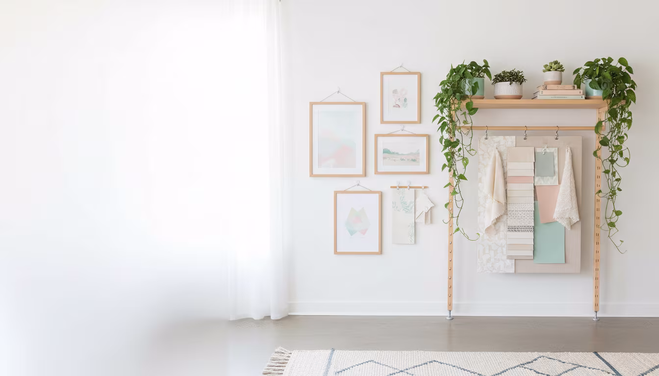
The Art of Creating a Curated Vignette on Any Flat Surface
Ever wonder how some people just effortlessly style shelves and tables? It's all about the art of...