How to Create a Cohesive Color Story Across Your Entire Home
A cohesive color story is what makes a home feel calm and intentional instead of like a series of unrelated rooms. It does not mean painting everything the same shade. It means choosing a small palette of hues and repeating them, in different proportions and materials, so the eye reads a connection as it moves from space to space. The work is mostly observation and restraint, and much of it can be done with things you already own.
Why cohesion matters
Color does more than decorate. A consistent palette creates visual flow, which makes a home feel larger and more considered. When adjoining rooms share an undertone, the transitions between them stop jarring and the whole space settles.
The opposite is a room full of unrelated decisions: a bold accent wall fighting a floral duvet next to a thrifted dresser in a clashing tone. Individually each piece may be fine, but together they read as visual noise. Streamlining the colors, often just by removing what does not belong, is usually enough to change how a room feels.
Reading your home's natural light
Before choosing any color, study the light, because the same paint looks like two different colors in two different rooms. A sage green that reads fresh in a bright, south-facing office can look muddy in a north-facing guest room.
Orientation is the key variable. North-facing rooms receive cool, indirect light that mutes and slightly darkens colors. South-facing rooms get warm light all day, which intensifies and warms them. East-facing rooms get warm morning light and cooler afternoons; west-facing rooms get soft mornings and intense, warm late-day light. Mirror and window placement changes this too, since reflected light bounces color around a room; the way mirror placement affects natural light is worth accounting for when a room feels dim. Take notes on how light hits each room at morning, midday, and evening before committing to a swatch.
The 60-30-10 framework
The 60-30-10 rule is a proportion guide for balancing colors in a room, and it scales up to a whole house. It is not a law, but it prevents the chaos of using several colors in equal amounts, which is what makes a space feel busy. The idea is a dominant color, a supporting color, and a small hit of accent.
| Role | Share | Where it appears | Typical example |
|---|---|---|---|
| Primary | 60% | Walls, large rug, sofa | A neutral like greige, cream, or soft gray |
| Secondary | 30% | Curtains, accent wall, armchair, large art | A complementary mid-tone that adds depth |
| Accent | 10% | Pillows, throws, ceramics, plants, candles | A bolder pop that is cheap and easy to swap |
Across a whole home, the primary color often stays consistent through connected common areas, while the secondary and accent colors shift subtly from room to room. That keeps each space distinct while maintaining a thread that runs through all of them. For the underlying vocabulary of dominant, complementary, and analogous colors, the Wikipedia articles on color schemes and color theory are solid references.
Finding your starting palette
Do not start with a paint fan deck and a blank wall. Start with an object you already own and love: a piece of art, a vintage rug, a favorite blanket, a photograph. Pull two or three colors from it and let those anchor everything else. A worn rug with muted blues, cream, and a hint of rust orange, for example, can dictate a living room and then flow into the adjoining spaces, which makes every later decision easier because you have a fixed reference.
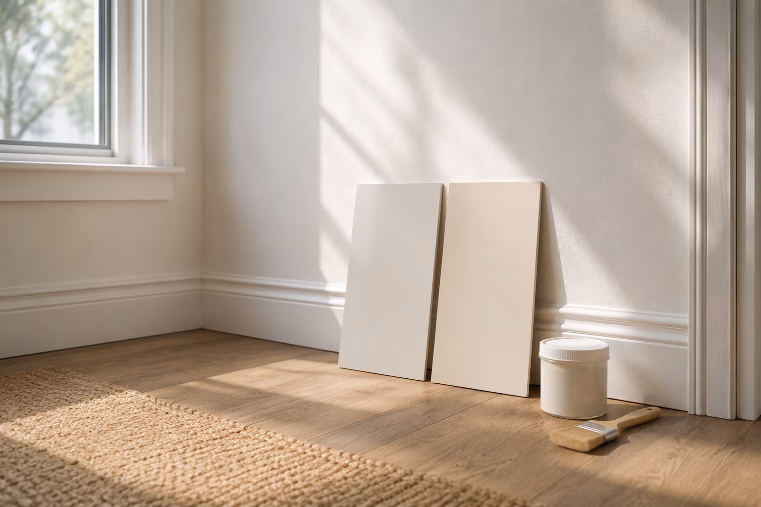
From that inspiration, choose your core. One dominant neutral becomes the 60% color: a cream, warm gray, soft greige, or a very pale version of a hue like sage. Then pick one or two supporting colors for the 30%. Buy sample pots rather than committing off a chip; paint large swatches directly on the wall and live with them for two or three days, checking them in morning and evening light. A few dollars in samples routinely saves a full repaint.
Connecting rooms and layering texture
To make rooms feel related, think about sightlines: what you see of the hallway or dining room while standing in the living room. The goal is gentle transition, not matching. The simplest trick is carrying one neutral through adjoining common areas, which reads as instant cohesion. Another is repeating a secondary or accent color in a different form next door, so a soft blue sofa in one room echoes as blue placemats or a piece of art with the same blue in the next.
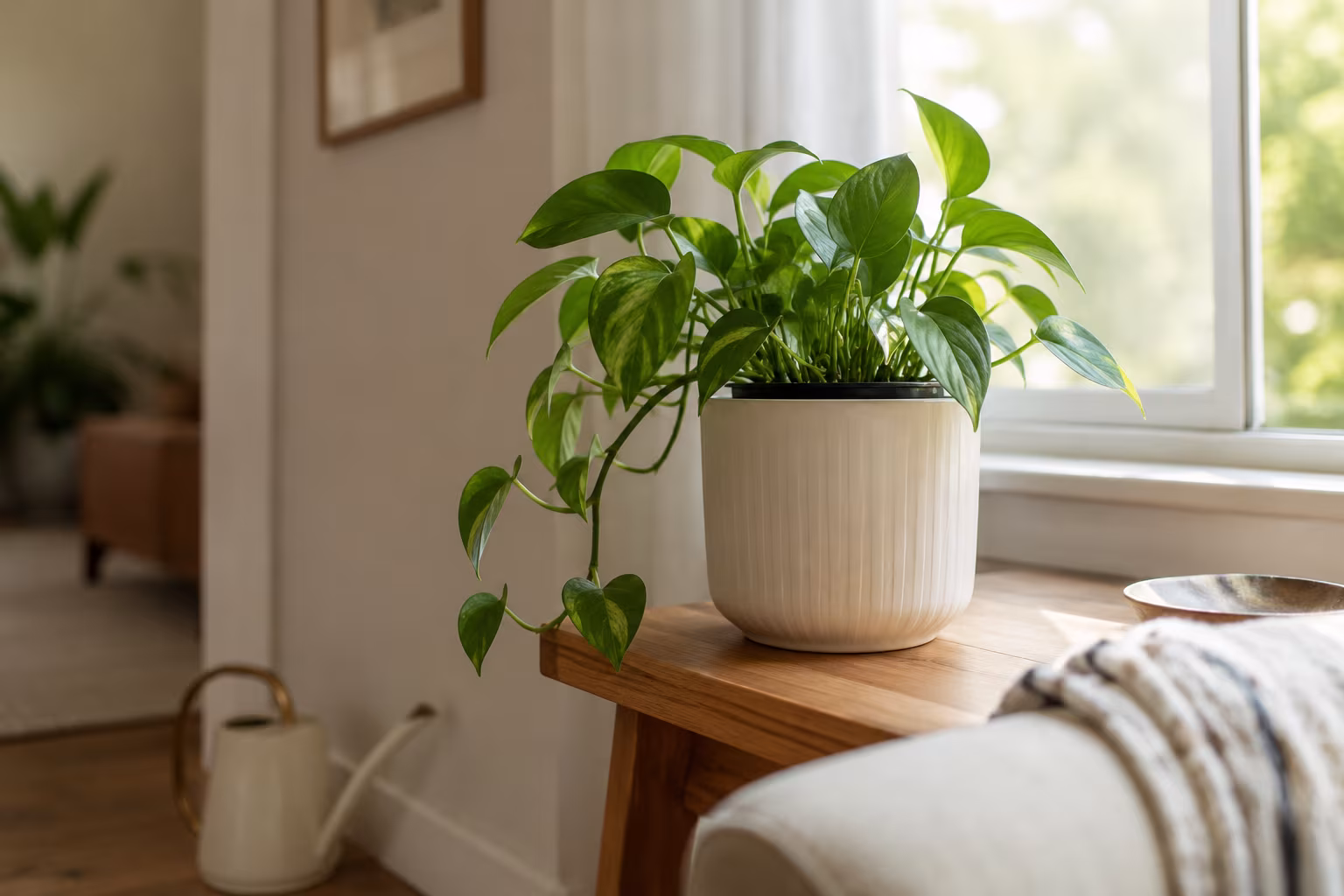
Color is not only paint. Wood, metal, flooring, and fabric all carry it. Check the undertones of your wood furniture, whether it leans warm (red, orange, yellow) or cool (ashy, gray), and whether your metal finishes lean warm (brass, gold) or cool (chrome, silver, black iron). Mixing warm oak or pine with cooler metals and cool gray planters creates contrast that keeps a palette from feeling flat. Materials like linen, wool, cotton, and velvet each absorb and reflect light differently, so bringing in natural textures like jute and linen adds depth without adding new colors.
Choosing accent colors
Accents are the 10%, and they are where the palette comes alive. Keep them to small, low-commitment items: throw pillows, blankets, candles, pottery, plants, books, and small art. Because they are easy and inexpensive to change, accents are also how you refresh a room seasonally, swapping a bright yellow pillow in summer for a deep rust throw in fall over the same muted green-and-cream base. Grouping and rotating them, rather than scattering many at once, is what keeps the effect intentional; the way you arrange throw pillows makes a measurable difference to how finished a sofa looks.
A practical way to spread an accent through the house is to repeat it in odd numbers and at varying heights: a rust vase on a low shelf in one room, a rust-toned book spine on a console in the next, a single throw on a bed further down the hall. The color registers as a deliberate thread rather than a coincidence, and because each item is small, the whole scheme stays cheap to adjust when your taste shifts.
Common mistakes
A few predictable errors undo an otherwise good plan. The first is the matchy-matchy trap: assuming cohesion means one exact shade everywhere, which flattens a room. Aim for harmony instead, using different tints and tones of the same color, so a soft blue primary is joined by a deeper navy and a pale robin's egg rather than one uniform block.
The second is ignoring pieces you already own. Building a new palette that clashes with a couch or an inherited armchair you cannot replace guarantees a room that always feels slightly off. Work those fixed elements into your starting point and pull from their undertones instead.
The third is too many accent colors. When every surface gets a bold pop, the quiet background colors start competing and the room feels chaotic. Hold each room to one or two accents that genuinely support the core palette, and confine bolder experiments to small, contained spaces like a powder room, laundry room, or craft corner that do not open directly into other rooms.
The last is forgetting the ceiling, sometimes called the fifth wall. White is a safe default, but a ceiling painted a light tint of the wall color, or a shade slightly darker, can add depth and a wrapped, cozy feeling. A very light gray ceiling a whisper darker than the walls reads as far more intentional than stark white.
None of this happens in a weekend. Expect weeks or months of gathering inspiration, testing samples, sourcing decor, and living with choices before a room feels settled, and expect to keep tweaking the accents long after. Renters are not excluded either: with fixed neutral walls as a backdrop, textiles, art, furniture, and plants carry the entire palette. Start with one object you love, pull its colors, and let the rest of the house follow it one room at a time.
Related Posts
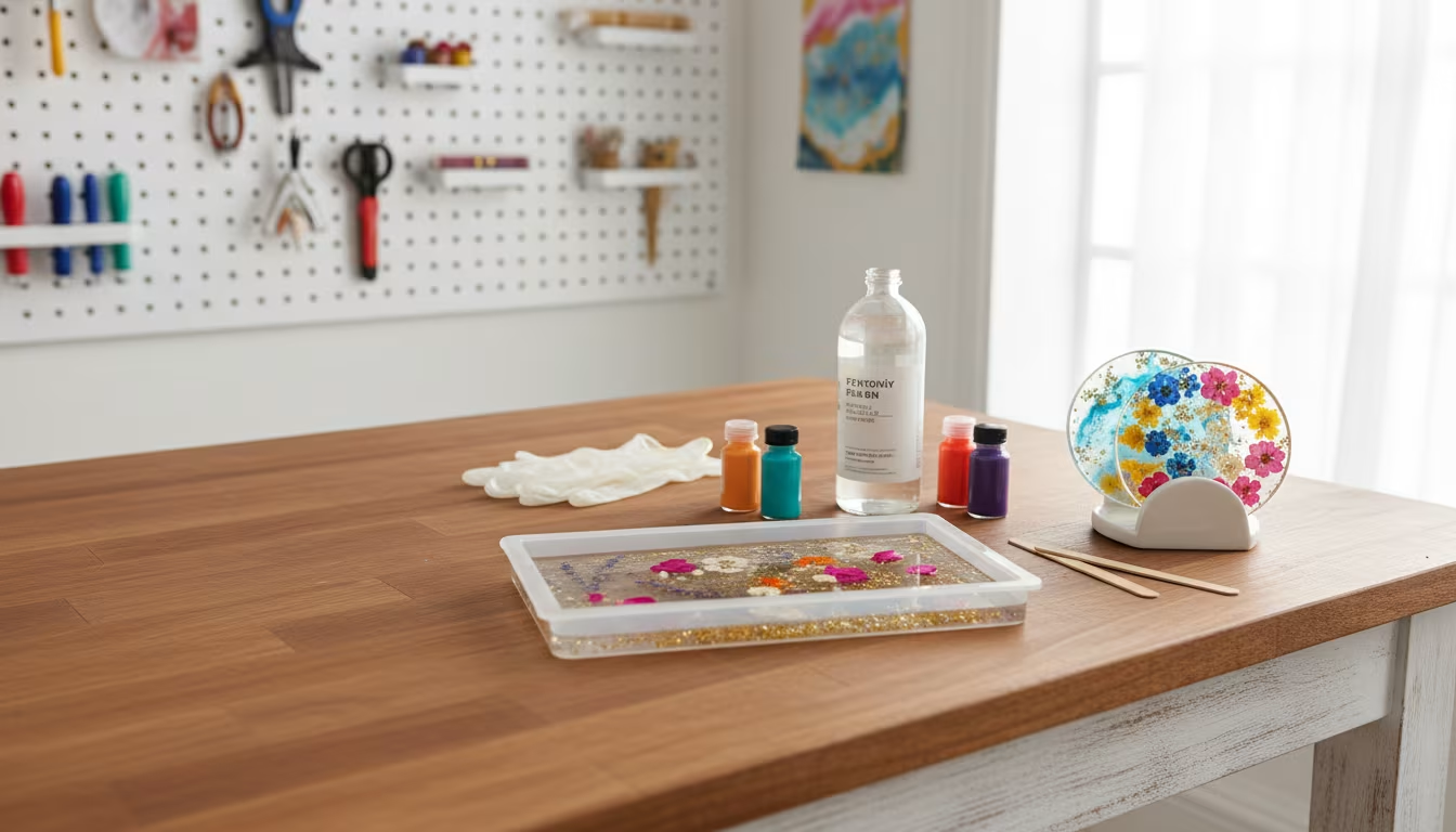
Indoor Plant Pot with No Drainage Hole: How to Make It Work
A no-drainage pot rots roots fast. Use the double-pot method, skip the gravel myth, pick...
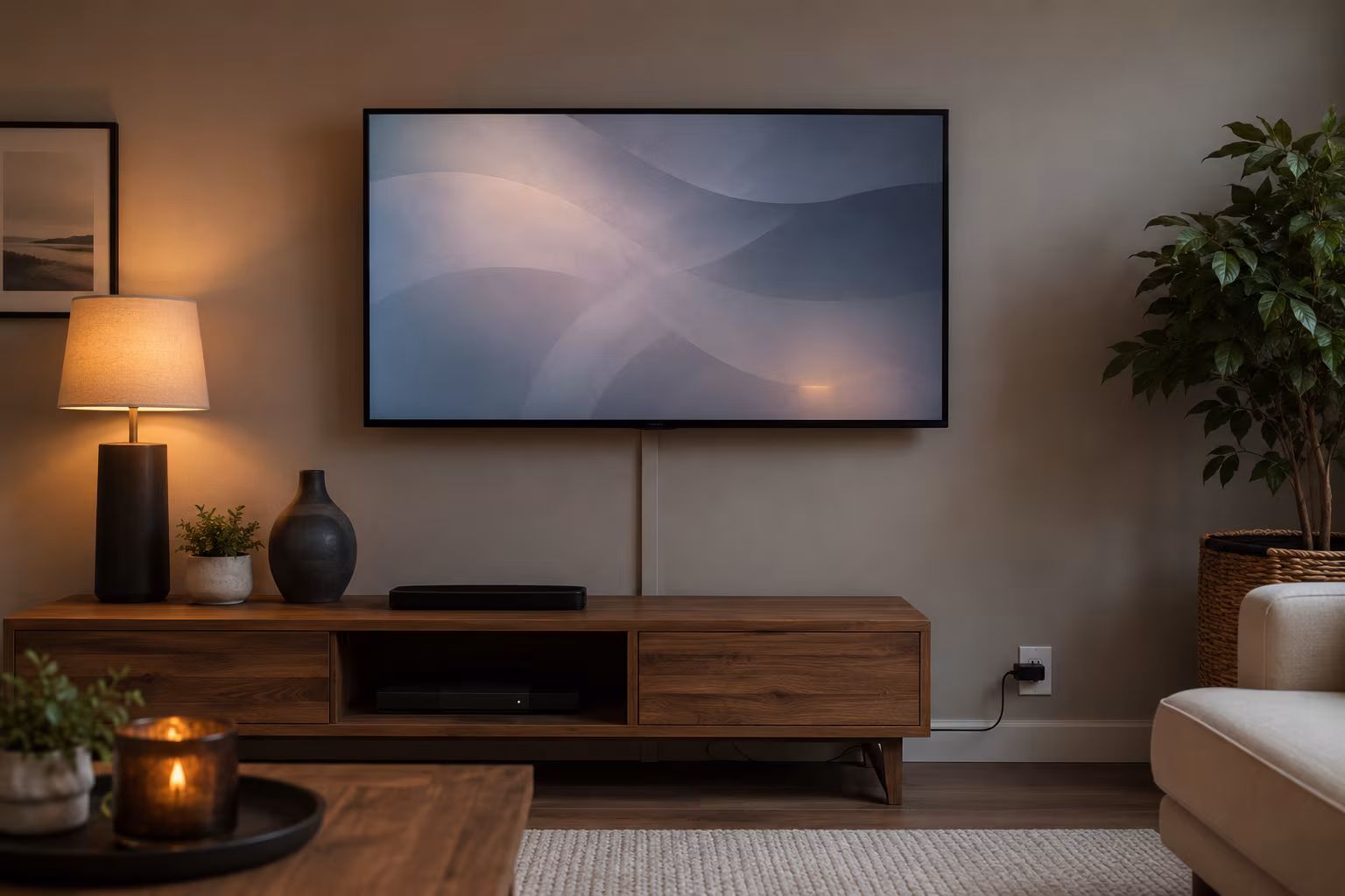
Hide TV Cable Clutter Renter-Safe Without Drilling
Hide a wall-mounted TV's cables without drilling: a paintable adhesive raceway to the outlet, a...
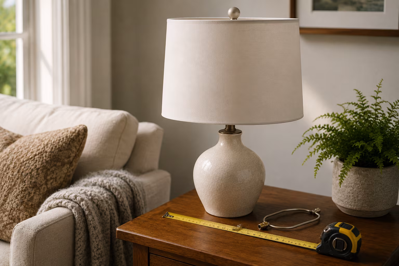
Lampshade Sizing: Harp, Bulb, and Drum Math Explained
Lampshade fit is three numbers: harp height near shade height, 3.5 inches of bulb clearance, and...
Color-Match Trim Paint to Existing Off-White Walls
Matching trim to aged off-white walls is about undertone, not lightness: cut a real chip, have...