Color-Match Trim Paint to Existing Off-White Walls
The short answer
Off-white is the trickiest paint colour to match because the human eye reads tiny undertone differences (warm vs cool, yellow vs grey vs green) very clearly while the eye reads the overall lightness almost identically. Two off-whites that look the same on a chip can clash dramatically on the wall.
The reliable matching routine is in four steps: cut a real paint chip from the wall (not just a swatch — actual painted surface), have the paint store scan it with a spectrophotometer, test the matched paint on a sample board in your room's actual light before committing to a gallon, and pair the sheen to whatever you are matching against. Skip any step and the match is approximate at best.
The fix when the match is wrong by a hair is to paint just the trim — not the wall — in the new colour and live with the slight contrast for thirty days. Most slight mismatches read as intentional contrast trim after a month; the ones that still look wrong needed full repainting from the start.
Why off-white is harder than other colours
Off-white is not really a colour. It is white with a small amount of pigment added — usually one of yellow, grey, beige, pink, or green undertones. The paint store's "white" base contains zero pigment; an off-white contains a small percentage of one or two specific pigments.
The eye is exquisitely sensitive to small pigment differences when the overall lightness is high. Two off-whites with identical L (lightness) values but different a and b values (warm vs cool, green vs magenta) will read clearly different on a large wall surface even though they look almost identical on a 2-inch swatch.
Matching off-white is therefore not about getting the colour roughly right. It is about getting the undertone exactly right. A warm cream trim against a cool grey-white wall reads as a different colour, not as a slight variation.
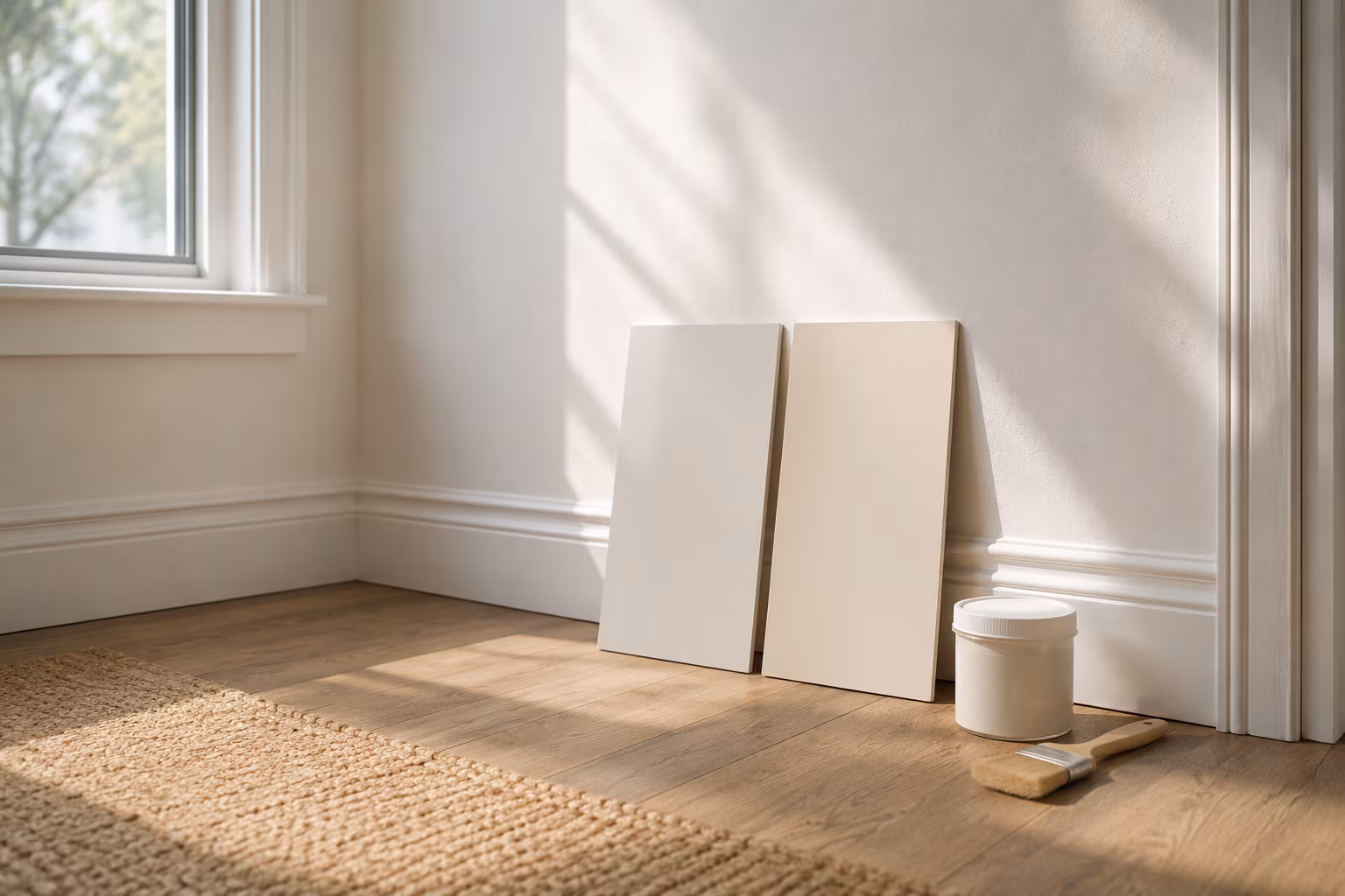
Step one: cut a real paint chip
Paint chips you bring to the store should be actual painted surface from your wall, not the colour-chip card from the original purchase. The card was printed; the wall has been painted, dried, oxidised, and aged. The two no longer match in detail.
To cut a chip without leaving an obvious patch: use a sharp utility knife to score a small square (about 1 inch on each side) from a low-visibility area. Behind a couch, inside a closet, under a shelf, or — the classic move — behind an outlet cover plate. Score four sides and pop the square out with the knife tip. Place the chip in a small plastic bag to prevent further oxidation.
The patch left behind is small enough to spackle and touch up later, or hide behind furniture you do not plan to move.
Step two: have the store scan it
Modern paint stores (Sherwin-Williams, Benjamin Moore, Behr, most independent paint shops) have a spectrophotometer that reads the chip's colour across the visible spectrum and matches to the closest mix from their catalog. The scan takes thirty seconds and reads more accurately than the human eye.
The match the machine produces is the closest available colour from that brand's pigment system. It may not be a perfect match — it is the closest mix from a fixed set of formulas. The store technician can then tweak the formula by adding small amounts of additional pigment to push toward the actual chip; ask for this fine-tune step explicitly rather than accepting the first machine output.
Bring the chip in good light. Fluorescent store lighting throws cool casts; the technician can compensate but only if they see the chip in conditions similar to where it will live.
Step three: test in your actual room light
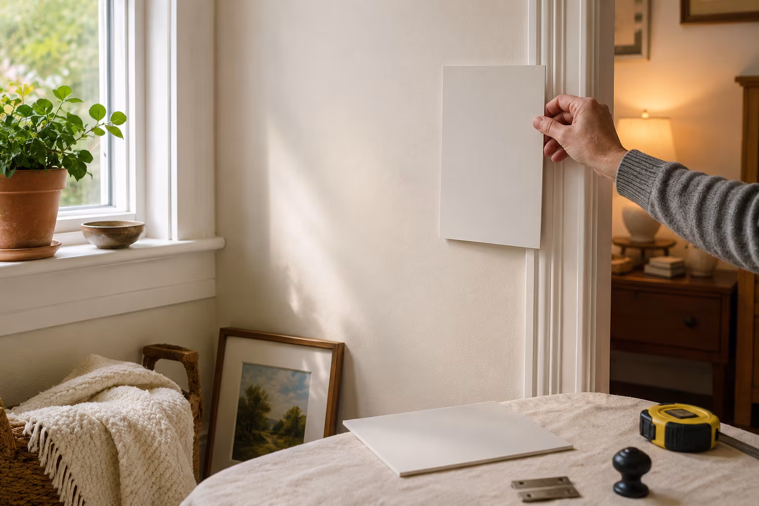
The matched paint may be perfect in the store under daylight-balanced fluorescent and still wrong in your home under incandescent dimmer-on-warm or under cool LED. Light source determines how the eye perceives the same paint.
Paint a sample on a piece of foam-core board (not directly on the wall — you want to move the sample around). Two coats, fully dry. Hold the sample against the existing wall and trim in the room where it will live, in the lighting conditions you typically have (evening lamplight, mid-day daylight, whatever applies).
If the sample matches in one light but reads warmer or cooler in another, the new paint has a different metameric behavior than the existing — the colours match under one light source but not under others. This is a real phenomenon, especially with off-whites. The fix is to ask the store for a metamerism-matched formula or to live with the slight difference under non-primary lighting.
Step four: match the sheen
Sheen (flat, eggshell, satin, semi-gloss, gloss) changes how light reflects off the paint surface. Two paints of identical colour but different sheen will appear different on the wall — the higher-sheen version reads cooler and slightly lighter because of the reflectance.
Trim is traditionally painted in semi-gloss or satin; walls in eggshell or flat. If your existing trim is semi-gloss and you match the new paint in eggshell, the new section will look wrong even with the colour right.
Tell the paint store the original sheen (you can sometimes read this off the dried surface: shiny = semi-gloss; soft glow = satin; barely-shiny = eggshell; matte = flat). Match the sheen as well as the colour.
Common mistakes that wreck the match
Skipping the actual paint chip. Bringing in the original colour name (if you know it) and trusting the brand to mix the same paint two years later does not work — pigment lots vary slightly, the existing wall has aged, and "same name" is no guarantee of "same colour".
Buying a full gallon without testing. The sample-board step costs the price of a sample pot and saves an entire gallon plus a weekend of repainting if the match is off.
Painting one trim piece and stopping there. Even a perfect match needs to be applied around the whole room to read correctly — paint dries differently in different humidity, and patches stand out.
Trusting the store's "looks the same" without scanning. Even experienced paint mixers cannot eyeball off-white accurately. The spectrophotometer is the right tool.
When the match is wrong and you have already painted
If the new trim is on the wall and reads differently from the original, you have three options:
Live with it for thirty days. About a third of slight mismatches stop bothering you once the rest of the room adapts to it. The trim is now part of the room rather than a swatch.
Tint the existing trim toward the new. Sometimes the cheaper move is to paint over the existing trim with the new colour throughout the room, making the new the standard. This works when the new colour is acceptable in isolation, just different from what was there.
Strip and repaint with a better match. Sand lightly, prime if needed, apply the corrected colour. This is the right answer when the mismatch is severe — usually a clearly different undertone that the eye reads as "wrong" rather than "slightly different".
How to read an off-white's undertone
Hold the off-white sample next to a piece of pure white paper. The undertone reveals itself: warm whites look yellowish or pinkish against pure white; cool whites look grey or blueish; greenish-whites look slightly olive.
Common off-white undertone families:
Cream / vanilla / butter — yellow undertone, warm Linen / parchment — slight yellow plus slight grey Greige (grey-beige) — neutral, slight beige Cool grey-white — blue or violet undertone Greenish off-white — yellow plus green pigments Pink-tinged off-white — yellow plus red pigments
Identify the undertone family of the existing wall first. Match new trim within the same family. Cross-family matches (a cool grey-white trim against a cream wall) almost always read as a clash, even with similar lightness.
When in doubt: simplify with semi-custom whites
If your home has off-whites you cannot identify or match, the long-term fix is to repaint walls and trim in a documented colour scheme from one brand's system. Benjamin Moore's Decorator's White, Sherwin-Williams Alabaster, Farrow & Ball Pointing — these and similar named colours have known formulas that can be re-bought reliably.
Switching to a named system means the next repaint, next touch-up, next addition can match without the spectrophotometer drama. The initial repaint is a project; the years that follow are easy.
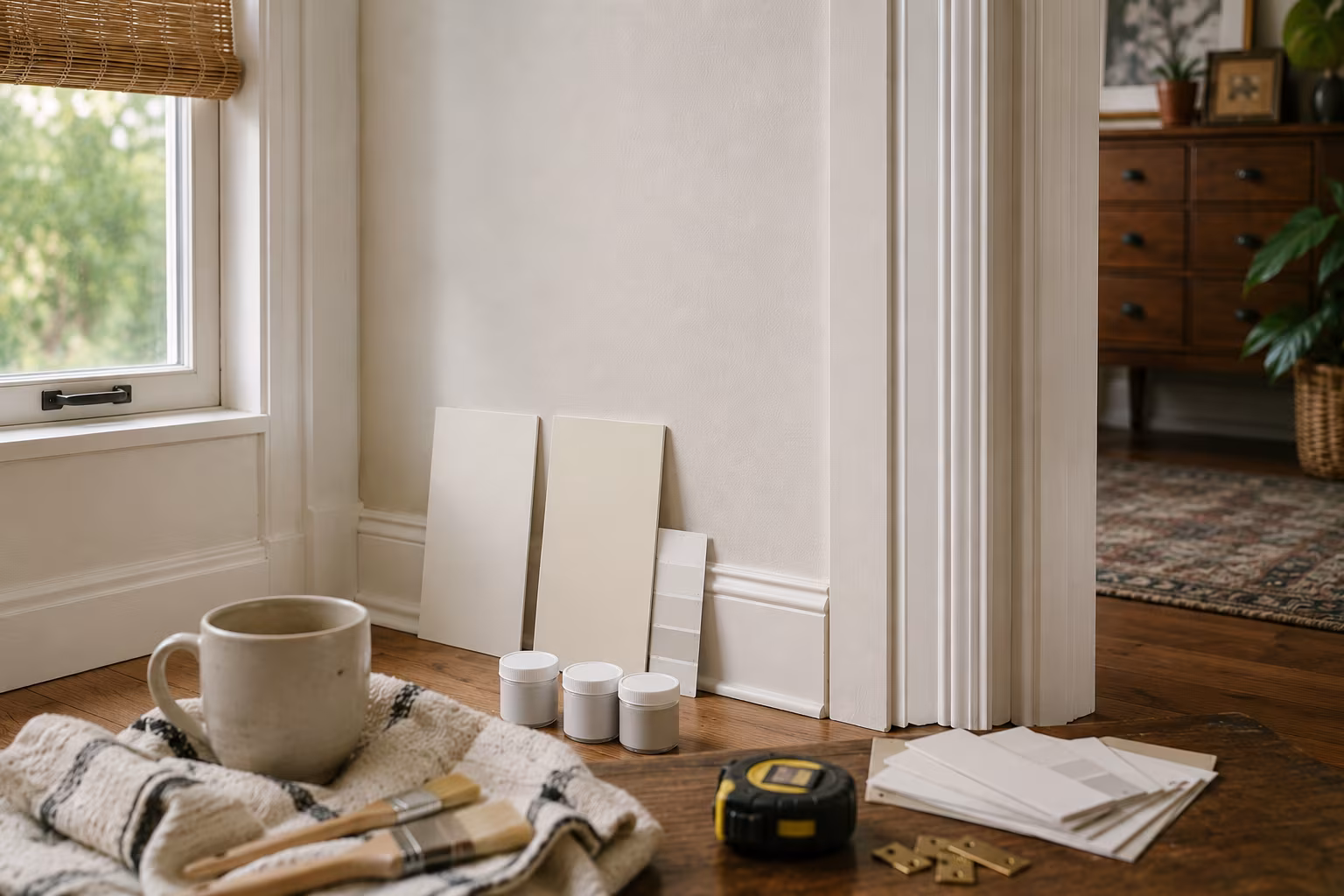
Sample boards: the underrated step
The sample-pot-on-foam-core approach is the single highest-leverage activity in colour matching. A two-dollar foam-core board and a fifty-cent paint sample pot save the cost of a full gallon and a weekend of repainting if the match is wrong.
Buy a 24x36 inch white foam-core sheet at any office supply or craft store. Cut it into 12x12 inch squares. Paint each square with the matched paint, two full coats with proper dry time between coats (don't apply both coats in one session — the result reads different from a real wall finish).
Move the sample around the room: against the wall at eye level, on the floor near the trim, at multiple lighting conditions through the day. The sample's behavior across these positions tells you whether the match holds up in real-world viewing.
Multiple samples at the same time help when comparing two candidate matches. Paint three boards — the matched paint, one shade warmer, one shade cooler — and compare side by side against the existing wall. The eye picks out the closest match more reliably with three options than with one.
Why store match attempts sometimes drift
Even with a spectrophotometer-scanned chip, the matched paint can drift slightly from the target. Two reasons:
The store's pigment system has finite resolution. The machine matches to the closest mix the system can produce, which may be slightly off the actual chip. For most colours this is negligible; for off-whites the eye notices.
The store's pigments themselves vary slightly between lots. A formula mixed today and the same formula mixed six months ago may produce slightly different results because the underlying pigments came from different batches.
For high-stakes matches, buy a full gallon, paint a sample board, and compare. If the match is acceptable, paint the room. If not, return the gallon (most stores accept returns of mis-tinted paint within a reasonable window) and try again with a fine-tuned formula.
Touch-up versus full-repaint decisions
The bigger decision than colour matching is whether to touch up the existing paint or repaint the whole room.
Touch-up makes sense when: the area is small (a few square feet), the existing paint is recent (less than a few years old), the original paint can or its formula is available, and the surrounding wall has not faded significantly.
Repainting the whole room makes sense when: the touch-up area is large, the existing paint is old and faded compared to the original formula, multiple repairs are visible across the room, or the colour will be slightly off no matter how carefully matched.
The economics often favor a full repaint over multiple touch-ups in the same room. A gallon of paint covers a typical room in one application; the time spent on careful patches that may still show is often more than the time spent repainting end-to-end.
The long view on off-white matching is to maintain a small notebook of formulas used in each room — brand, colour code, sheen, and the date painted. The next match years from now becomes a five-minute conversation at the paint counter rather than a chip-extraction project. The notebook costs nothing and saves hours every few years.
When to bring in a professional colour consultant
For whole-home repaints with multiple rooms flowing into each other, or for situations where the existing colours include hard-to-identify off-whites mixed with statement colours, a professional colour consultant earns the fee. The consultant brings a trained eye for undertones, a working knowledge of the major paint brand systems, and a willingness to recommend painting decisions you may not have considered. The cost is modest compared to repainting a wrong colour and the consultation is a one-time fee.
Related Posts
How Far to Extend Curtain Rods Past the Window Frame
How far the rod should reach past each side of the window, why the extension matters more than ro...
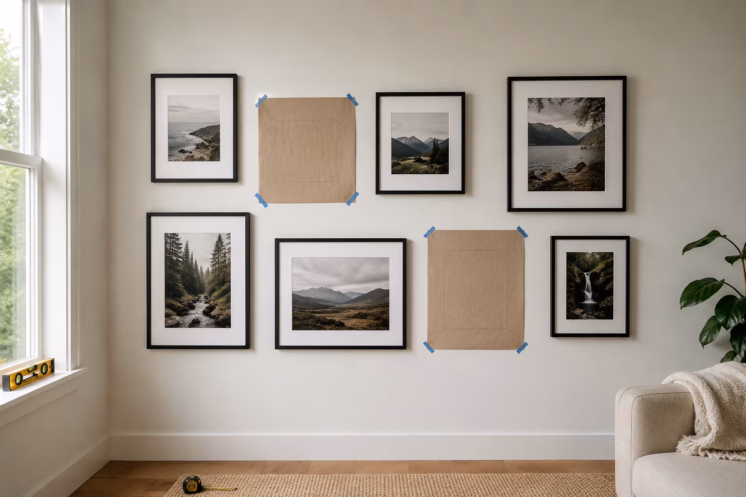
Gallery Wall Picture Spacing: The Repeatable Method
Stop eyeballing it — the exact spacing, center height, and paper-template routine that turns a pi...
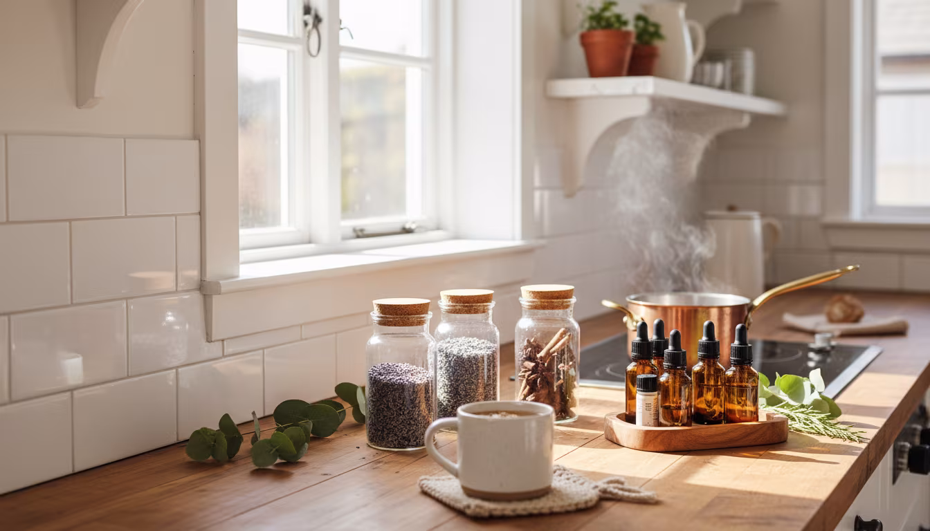
The Secret to Making Your Home Smell Amazing Without Artificial Sprays
Tired of chemical-laden air fresheners? Learn how to fill your home with beautiful, natural scent...
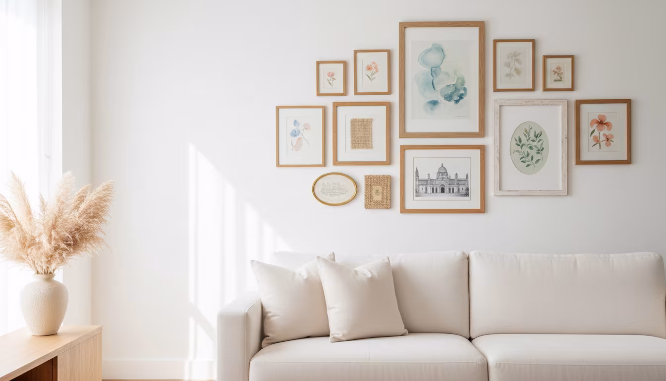
How to Arrange Art Above a Sofa Using the Right Proportions
Tired of staring at a blank wall above your couch? We'll show you exactly how to choose and arran...