Gallery Wall Picture Spacing: The Repeatable Method
The short answer
Two numbers do most of the work. Aim for two to three inches of gap between every frame, and center the whole arrangement so its visual middle sits at about 57 inches from the floor. That is the museum-standard eye-level number used in galleries worldwide, and it stays consistent room to room, so the same arrangement reads correctly above a sofa, in a hallway, or in a stairwell landing.
Everything else — the kraft-paper template, the consistent gap, the variety in frame sizes that still feels cohesive — is in service of those two numbers. If you only remember one rule from this whole article, it is: 57 inches to the visual center, and 2 to 3 inches between frames. Pictures hang too high in most homes; this rule pulls them down to where the human eye actually sits.
The 57-inch center rule and why it works
The 57-inch height is calibrated to the average eye level of a person standing in a room. Galleries and museums use it because their visitors are standing; when you sit on a sofa your eye drops to around 40 inches, but for the room as a whole, you want the art to feel like it belongs to a person walking through, not to someone parked on the couch. Pictures that feel "too high" in a living room almost always have their center somewhere between 62 and 70 inches from the floor.
The 57-inch number refers to the visual center of the whole arrangement, not the center of any single piece. For a gallery wall with one large anchor frame plus six smaller satellites, the anchor frame's center should be near 57 inches and the satellites stack around it. For a symmetric grid of six identical frames, the center of the whole grid (the point where the gap-cross meets in the middle) is at 57 inches.
Adjust the rule when the wall demands it. Above a sofa, drop the bottom of the lowest frames to 6-10 inches above the seat back rather than holding rigidly to 57 inches; very tall rooms (10+ feet) tolerate a few inches higher; stairwell walls follow the angle of the stairs and you set a sloped baseline instead. The 57-inch number is a default that wins most of the time, not a law.
Spacing the gaps — why 2 to 3 inches
The spacing between frames does a precise visual job: it ties them together into a single readable unit. Frames more than four inches apart start to look like separate islands floating on a wall; frames closer than one and a half inches start to read as one chaotic block with no rhythm. The 2-3 inch range is where the eye reads them as a family.
Keep the spacing consistent across the whole arrangement. Two inches everywhere reads as tighter, more graphic; three inches everywhere reads as airier, slower. Mixing two and three within one wall makes the gaps themselves look careless. Pick a number for the wall and hold it.
Measure gaps frame edge to frame edge, not center to center, and not from the mat. Frame styles with thick mouldings have very different visual gaps from frame styles with thin metal edges even at the same physical distance; the rule is about how the eye reads the white space, not the math.
For corners and outlets, the same gap applies as much as you can: keep at least the frame-to-frame gap distance between the outer frames and a corner, a baseboard, the ceiling, or a light switch. Crowding into a corner makes the arrangement feel cramped.
The kraft paper template method
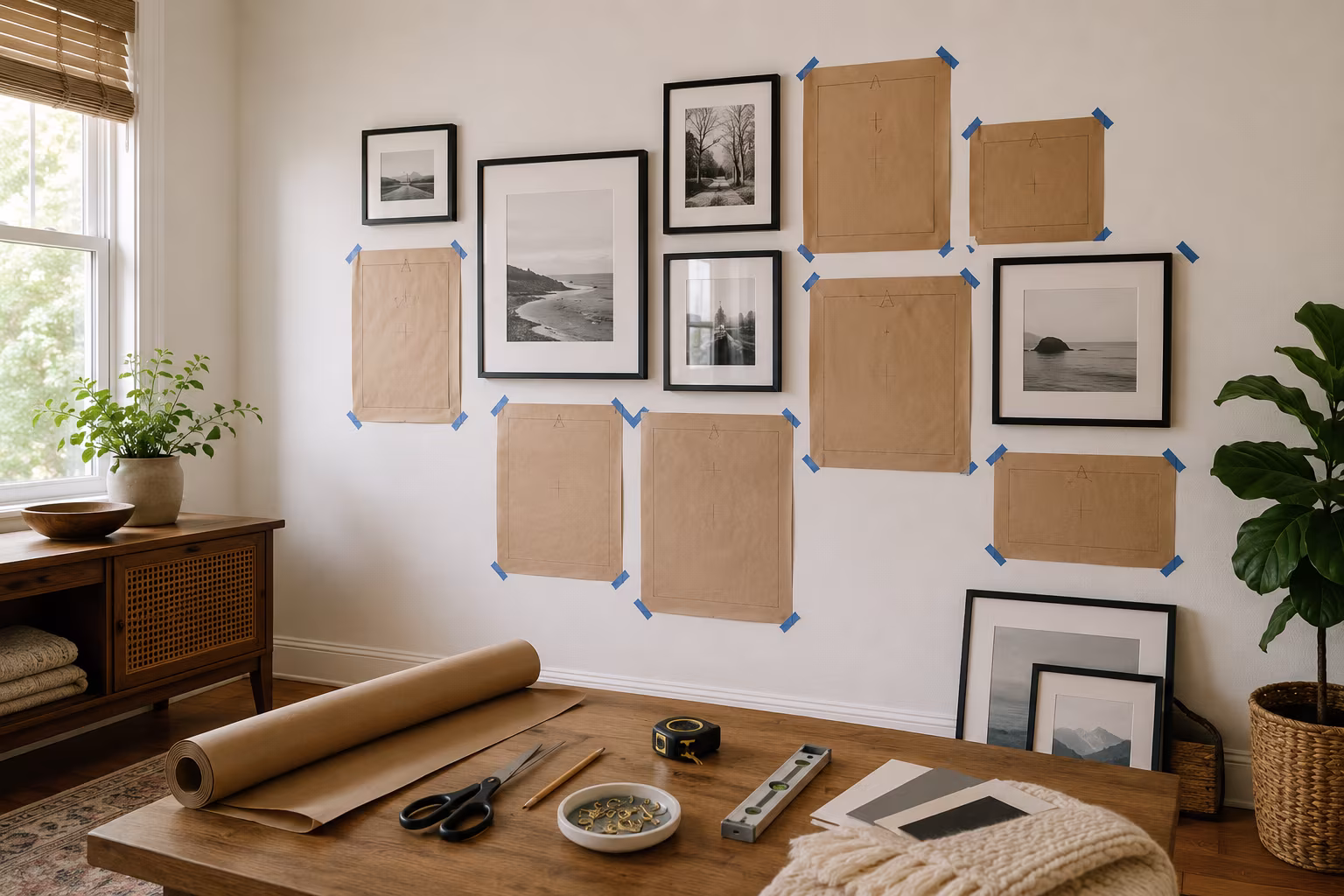
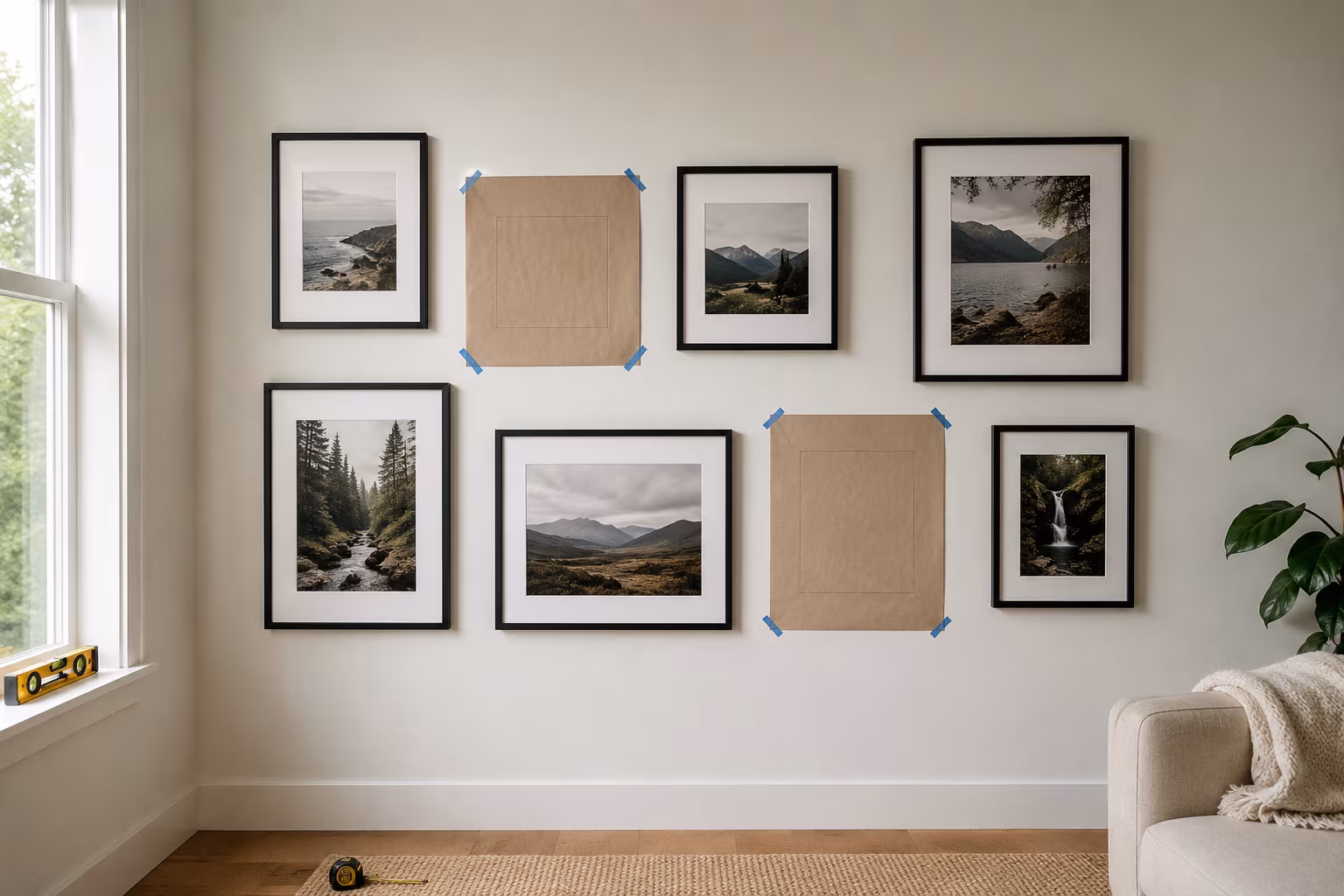
Most botched gallery walls are the result of nailing first and adjusting later. The repair is the paper-template method, which lets you do the entire arrangement on the wall with painter's tape before anything is permanent.
What you need: a roll of brown kraft paper or butcher paper, a pencil, scissors, painter's tape (the blue 3M kind that lifts off paint without damage), a tape measure, and a small bubble level.
The routine: lay each frame flat on the kraft paper and trace its outline with the pencil; mark the position of the hanging hardware (D-rings, sawtooth, wire) on the back of the paper with a clear X, then flip the paper so the X is now facing the wall side. Label each tracing with the frame and orientation. Cut the tracings out.
Tape the cut-outs to the wall with painter's tape at the top corners only. Slide them around freely. Stand back ten feet, sit on the sofa, look at the wall from where it will actually be seen. Move things until the spacing is even and the arrangement reads as one piece. This stage takes thirty minutes to an hour, but it is where you save yourself from hidden nail holes.
When the layout is right, drive the nail or screw directly through the X on each paper template — the paper tells you exactly where the hardware lands, with no measuring of the frame back at all. Then tear the paper off, hang the frame, and check level. The technique is forgiving with everything except wallpaper, where painter's tape can lift the print.
Layouts that read as one piece vs scattered
Four layout patterns cover most successful gallery walls.
Grid: rows and columns of identical or near-identical frames, even gap on all sides. Looks formal, controlled, photo-studio. Best for collections that already share something obvious — a set of botanical prints, family portraits in matching frames, postcards from one trip. Forgives the least frame variety.
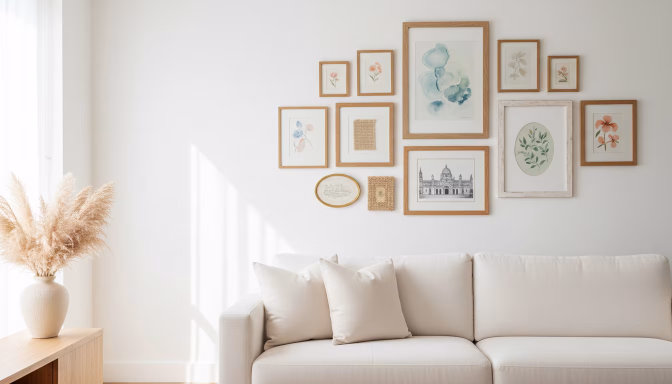
Symmetric anchor: one large anchor piece in the center, balanced smaller pieces flanking it on both sides. Symmetrical left and right. Works above sofas and beds.
Asymmetric anchor: one large piece off-center (typically lower-left or lower-right), with a cluster of smaller pieces filling outward from it. Looks designed but not forced; this is the typical Pinterest gallery wall. Works on any wall but needs careful spacing to avoid looking truly random.
Line: all frames sit on one horizontal baseline along the bottom. Works in hallways and above stair landings where you have a long wall and varied frame heights. The bottom edge is the constant; tops vary.
The failure mode in all four is the same: the eye sees one piece that breaks the rhythm — a frame too far from its neighbour, one tilted off the baseline, a colour that punches out of the palette. Removing the offender almost always rescues the wall.
Frame variety: what mixes and what fights
The shortest rule: pick one constant. Either the frame style is constant and the art varies, or the art style is constant and the frames vary. Both varying at once creates visual noise without intent.
A cohesive frame mix that works: all black wood frames in different widths and depths; all natural wood frames in different finishes; mixed metals (matte black, brushed brass, polished chrome) on a single colour palette of art; identical white frames around prints of wildly different subjects.
A frame mix that fights: ornate gilt frame, modern thin black metal frame, and reclaimed barn-wood frame on the same wall. Each is interesting on its own; together they shout. If you have inherited a mix like this, paint several frames the same colour to reduce the variety to two styles instead of three.
Mat colour matters more than people think. A consistent mat (usually white or off-white) ties wildly different prints together. Coloured mats are for pieces that want to stand alone, not gallery wall members.
Hanging hardware: nails, picture hooks, command strips
For frames under five pounds (most 8x10 and 11x14 pieces), a simple picture-hanging nail driven at a shallow angle holds reliably in drywall. Use one nail per frame for sub-eight-inch widths and two nails for anything wider, level the frame on a small bubble level, and use clear vinyl bumpers on the bottom corners so it does not drift.
For frames between five and twenty pounds, picture hooks rated for the weight (the small brass-look hooks with one or two nails through them) outperform plain nails. The hook spreads load onto the wall and the nail's angle does the holding work.
For frames over twenty pounds, drywall anchors or hitting a stud become non-negotiable. Toggle bolts or self-drilling anchors rated for the weight prevent the nail-pulled-out failure that turns into a hole the next time you hang anything.
Command strips and similar adhesive systems work for very lightweight frames in rental situations, but the weight ratings are conservative; if the package says "up to four pounds," treat that as three. Failures of adhesive hangers almost always show up months later when the bond fatigues, not the day of install. For renters with valuable art, picture-hanging strips are the renter-safe answer; for paper prints in cheap frames they are fine.
Common mistakes and how to fix without holes
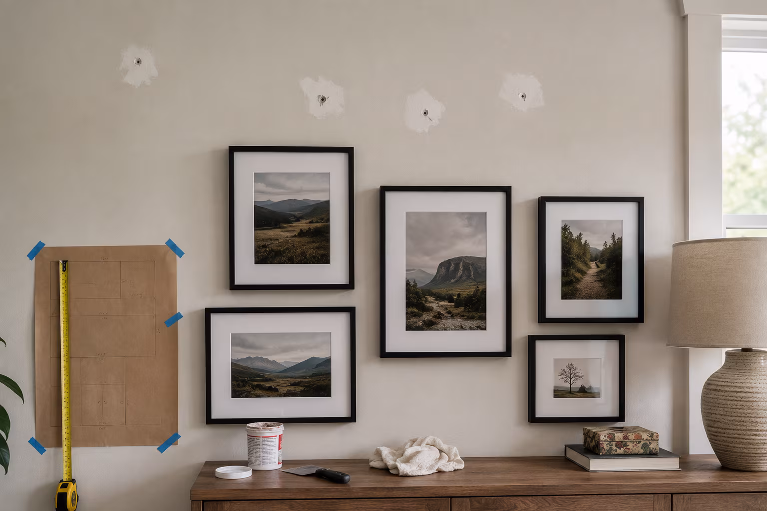
Hanging too high is the failure mode in most living rooms. The fix: pull the visual center down to 57 inches and live with the fact that the old nails are now four inches above your frames. Repair the old holes with a swipe of lightweight spackle and a touch-up of wall paint; the gallery wall hides the rest.
Uneven gaps that you cannot un-see. The fix: pick the worst three frames and re-hang them, ignoring the others. Measure twice with a tape, do not eyeball.
A layout that looks fine in the layout but wrong on the wall. The fix: stand at the actual viewing distance — usually six to ten feet, not your install-arm length. Galleries always view from where the visitor stands. If your wall is across the room, plan from across the room.
A wall that feels too busy. The fix: remove one or two frames entirely. Most over-busy walls are not spacing problems; they are too-many-frames problems. The arrangement reads cleaner with breathing room than with maximum coverage.
Special situations: stairs, corners, and around furniture
Stairwell walls follow the staircase angle. The visual center of each frame steps up with the stairs rather than holding a flat horizontal line. The 2-3 inch gap rule still applies between frames, but those gaps are measured perpendicular to the staircase angle, not horizontally on the wall. The result is a stepped arrangement that mirrors the stair angle and feels grounded.
Corners want a small buffer of empty wall, usually a few inches wider than the standard between-frame gap. Frames pushed into a corner read as accidentally placed; the same frames pulled four to six inches off the corner read as deliberate.
Above a sofa or bed, the lowest edge of the lowest frame should sit between six and ten inches above the top of the furniture. Closer than that and the frames look perched on the furniture; farther than that and there is a visual gap between the art and the room.
Around a TV, treat the TV as a frame in the arrangement. Use the same gap to neighbouring frames as you would between frames themselves, and aim for the TV center plus the visual center of the surrounding frames to share the 57-inch reference line where possible. Asymmetric arrangements around a TV usually look more natural than symmetric ones because the TV's screen content competes with symmetric framing.
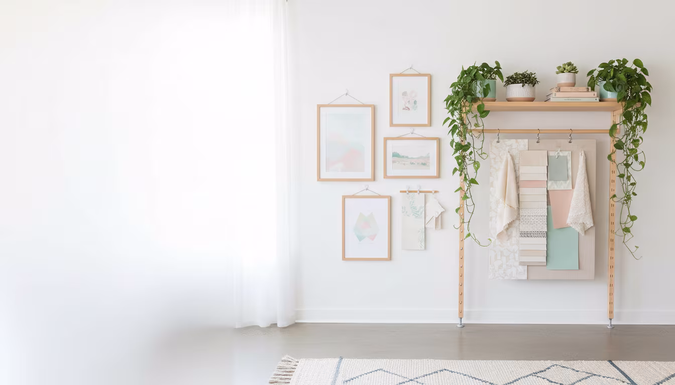
Narrow vertical walls (the space between two doorways, or a strip beside a window) take stacked single-column arrangements better than gallery clusters. Three or four frames stacked vertically with the standard gap and the column centered on the wall reads strong; a cluster attempts on a narrow strip looks cramped.
A final note on long-term gallery walls
A gallery wall is not a permanent installation, and the best ones evolve over time. Treat the kraft paper templates as the working layout document — save them rolled up after the install so the next swap is faster. New pieces get traced, slotted into the layout on the wall, and the existing pieces shift to accommodate. Over years, a gallery wall built this way reflects whoever is living with it rather than a single decorating moment, and the room ages with it instead of looking like a snapshot.
Related Posts
How Far to Extend Curtain Rods Past the Window Frame
How far the rod should reach past each side of the window, why the extension matters more than ro...
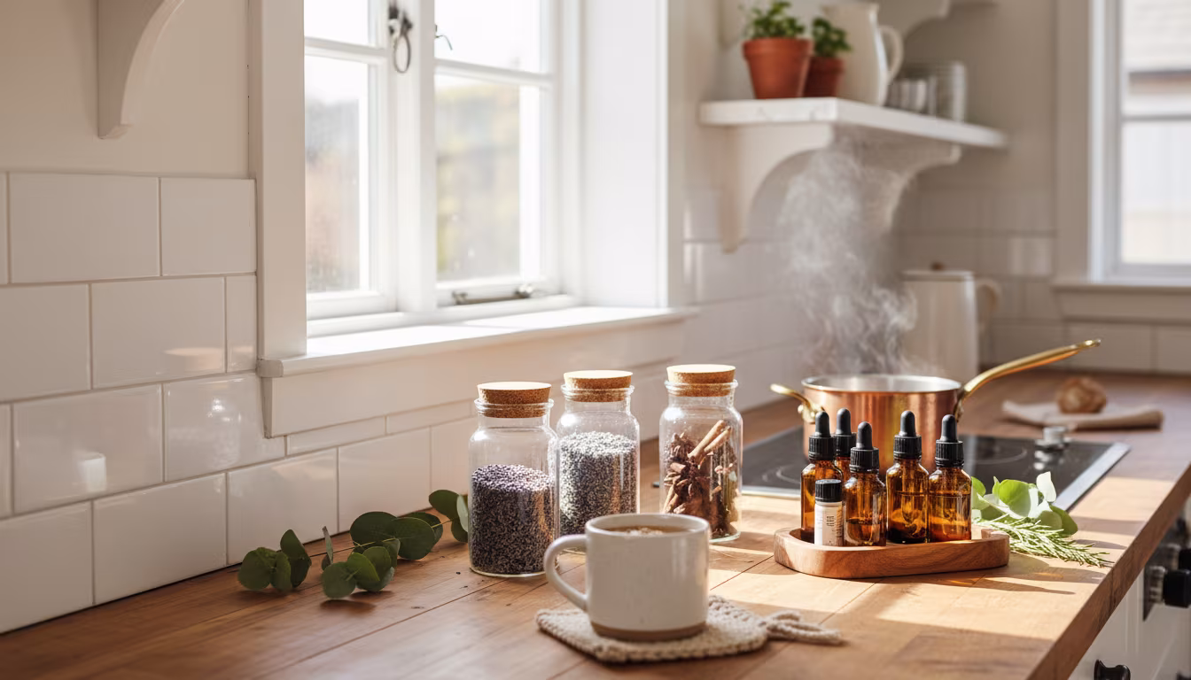
The Secret to Making Your Home Smell Amazing Without Artificial Sprays
Tired of chemical-laden air fresheners? Learn how to fill your home with beautiful, natural scent...
How to Arrange Art Above a Sofa Using the Right Proportions
Tired of staring at a blank wall above your couch? We'll show you exactly how to choose and arran...
How to Decorate a Rental Apartment Without Damaging Any Walls
Dreaming of a stylish rental pad but worried about losing your deposit? We've got you covered wit...