How to Style a Minimalist Gallery Wall with Personal Meaning
A minimalist gallery wall is a curated cluster of art and objects arranged for calm rather than density. The point is not fewer items for their own sake, but intentional choices, generous spacing, and a consistent visual thread so the wall reads as one composed piece instead of a scattered collection. Done well, it tells a quiet story: a hand-drawn neighborhood map, a vintage postcard, a pressed flower, each cheap on its own but meaningful together.
This guide walks through the whole process, from settling on a theme to hanging the last frame straight. The method leans on planning off the wall first, which is what prevents a scatter of extra nail holes and crooked frames.
Why a Minimalist Gallery Wall Works
A single large piece makes one statement. A thoughtfully arranged group tells a layered story, and it does it without visual overload when you leave room to breathe. Minimalism here means intention, not stark white walls, so you choose a few pieces that genuinely resonate rather than filling every gap because it is empty.
The restraint is what gives the wall its calm. Empty space around each item lets the eye rest and quietly emphasizes what you did choose to hang. That is why swapping a generic $20 store print for three small, personal pieces often makes a room feel more finished, not less. The pieces cost less and carry far more meaning.
Finding Your Theme and Aesthetic
Before hanging anything, settle on a loose guiding principle. It does not need to be strict; it needs to answer one question: what feeling should this wall create? A "natural and personal" theme, for example, pulls together botanical prints, candid black-and-white photos, and a carved wooden object. The context of the room narrows it further, since a muted bedroom wall calls for different pieces than a bright entryway.
Three levers keep a mixed group cohesive:
- Color palette. Limit yourself to two main colors and one accent. Muted tones and neutrals read as calm; a single repeated pop of color can tie unrelated pieces together.
- Subject matter. Find a common thread such as landscapes, botanicals, family photos, or one medium like linocuts or watercolors. A shared subject holds the wall together even when styles vary.
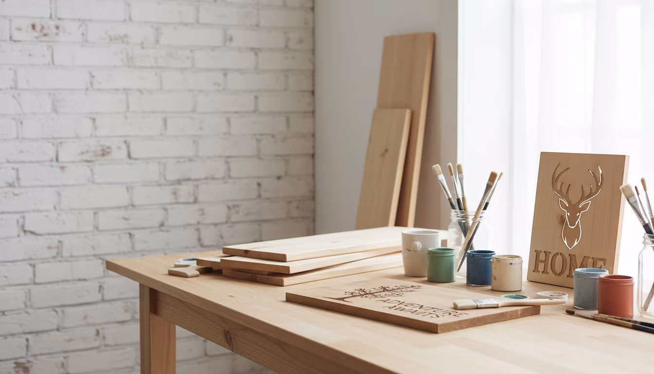
- Frame style. This matters most for minimalism. Stick to simple frames in natural wood, matte black, or white. Mixing ornate styles reads as cluttered fast. Plain thrifted frames run about $2 to $5 each and spray-paint to a uniform finish in one afternoon.
Gathering Pieces Worth Hanging
Cast a wide net at first. Gather anything that catches your eye or holds a memory, then edit down later. Old photo albums, thrift stores, and antique shops turn up interesting art, empty frames, and postcards for a few dollars. A vintage map for $5 can anchor an entire wall.
Do not limit yourself to flat art. A small ceramic dish, a pressed flower frame, a tiny mirror, or a carved wooden block adds texture and depth that pure prints cannot. Objects with real weight need heavier hardware, so note which pieces are three-dimensional as you collect them.
Personal pieces almost always beat generic store art, and they cost less. Handwritten notes, concert tickets, a child's drawing, a pressed leaf, a page torn from an old book, or a patterned fabric swatch all work when framed simply. One or two slightly imperfect items, a candid photo or a piece with visible age, keep the wall from looking staged, like a catalog page. Gather more than you need, since editing down from a wide pile produces a stronger final group than stretching to fill space with whatever you have.
Choosing Your Hero Pieces
From the full pile, pick one to three hero pieces. These are the largest, most striking, or most personally significant items, and they act as anchors for everything else. For a smaller wall, a single hero is enough; a wall over about six feet wide can carry two or three.
Scale is the deciding factor. A large botanical print might anchor by size, with a smaller but meaningful photograph placed beside it so the photo holds a place of honor without competing. The hero pieces set the general flow and spacing that the smaller items then fill in around.
A common sizing approach is one hero piece around 16 by 20 inches or larger, two or three mid-size frames near 8 by 10 or 11 by 14, and a handful of small 5 by 7 accents. Odd numbers of pieces tend to read as more organic than even ones, and keeping the heroes off the exact center of the wall avoids a stiff, symmetrical look while still feeling balanced.
Lay It Out on the Floor First
This is the single step that saves the most frustration. Lay every chosen piece on the floor or a large table, roughly matching the size and shape of the wall space. You can rearrange freely here, with no commitment and no holes.
Start with the hero pieces slightly off-center, then fill in smaller items for a balanced flow, always leaving breathing room between them. Photograph each arrangement you like with your phone so you can compare options side by side. A thorough layout can take an hour or two of trying a grid, then an organic cluster, then something between, but it is far cheaper to move paper and frames on the floor than to re-drill the wall.
Transfer to the Wall: Template or Tape
Once the floor layout is set, move it to the wall by one of two methods.
The template method
Trace each frame onto kraft paper or newspaper, cut the shapes out, and tape them to the wall in your chosen arrangement. This is the precise option: you slide the paper cutouts around until the spacing looks right, then drive the nail straight through the paper where the hanger sits. Peel the paper away afterward.
The painter's tape method
For a looser, free-form wall, mark the top, bottom, and sides of each frame with small pieces of painter's tape, then note where the hanger falls. It is less exact but faster if you are comfortable eyeballing. Skipping this planning entirely is how you end up with five extra holes and a crooked frame, so use one method or the other.
Spacing and Height That Read as Intentional
Even spacing is what makes a mixed-size group feel deliberate rather than random. Aim for a consistent 2 to 4 inches between frames, checked with a ruler or a small level both horizontally and vertically. A cut piece of scrap wood at your chosen gap width, held between frames as you hang, keeps spacing uniform faster than measuring every gap.
Height follows the museum standard: hang the center of the wall, or of the main hero piece, at eye level, roughly 57 to 60 inches from the floor. Art hung too high floats toward the ceiling and breaks the calm. The reference points below keep the arrangement grounded.
| Element | Target measurement | Why it matters |
|---|---|---|
| Center of arrangement | 57-60 in from floor | Standard eye level; comfortable to view |
| Gap between frames | 2-4 in, kept consistent | Reads as intentional, not scattered |
| Art above a sofa | 6-8 in above the back | Visually connects wall to furniture |
| Breathing room at edges | Larger than inter-frame gaps | Keeps the group contained and calm |
Hanging Hardware by Weight
Match the hardware to the weight of each piece. Small angled picture-hanging nails leave a tiny hole and hold a surprising amount, which suits most lightweight frames. For heavier pieces or three-dimensional objects, use rated picture hangers and, where possible, drive into a stud. Adhesive strips hold genuinely light frames without a hole, which is useful in a rental or if you rearrange often. Keep a level within reach and check each piece the moment it goes up, since one tilted frame undoes the whole calm effect. Simple picture frame hardware, meaning a sawtooth hanger or a D-ring and wire, is enough for nearly everything on a minimalist wall.
Common Mistakes to Avoid
The most frequent error is trying to fill every blank inch. Empty space is part of the design; it gives the eye somewhere to rest and highlights the pieces you kept. Resist the urge to add "just one more."
The second is inconsistent frame styles or colors. A little variety is fine, but a jumble of mismatched frames reads as clutter. Spray-painting a thrifted mix to one matte black, white, or wood tone unifies them instantly and cheaply.
The third is hanging too high, which the 57-to-60-inch center rule solves. The fourth is forcing a beloved piece onto a wall where it breaks the flow; it is fine to save that piece for another spot and rotate it in later. And the last is poor lighting: a wall in a dark corner loses its detail, so add a small directional picture light or make sure the room's ambient light reaches it. After everything is up, step well back and edit. If one piece feels disconnected, take it down and patch the small hole. Removing a piece is not a failure; it is the final step that makes the arrangement feel resolved. Even in a rental, you can get this look with a limited minimalist color palette, adhesive strips, and a picture ledge that leans against the wall so the art rests on it with no nails at all.
Related Posts
Indoor Plant Pot with No Drainage Hole: How to Make It Work
A no-drainage pot rots roots fast. Use the double-pot method, skip the gravel myth, pick...
Hide TV Cable Clutter Renter-Safe Without Drilling
Hide a wall-mounted TV's cables without drilling: a paintable adhesive raceway to the outlet, a...
Lampshade Sizing: Harp, Bulb, and Drum Math Explained
Lampshade fit is three numbers: harp height near shade height, 3.5 inches of bulb clearance, and...
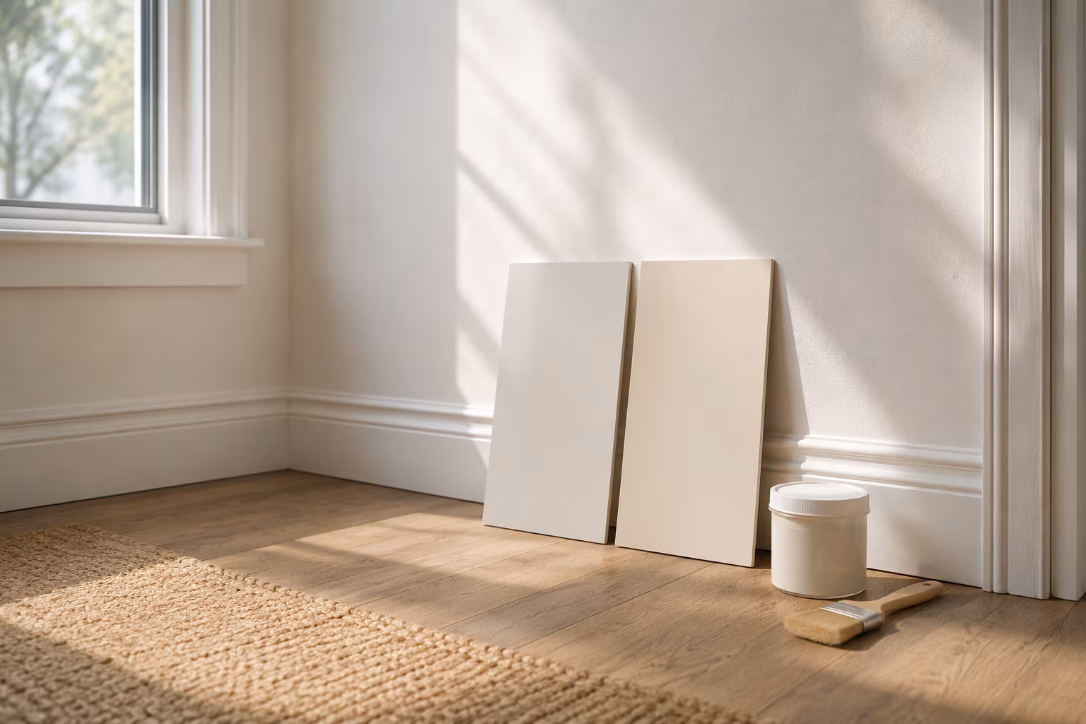
Color-Match Trim Paint to Existing Off-White Walls
Matching trim to aged off-white walls is about undertone, not lightness: cut a real chip, have...