
The Secret to Using Negative Space to Make Your Living Room Feel Larger
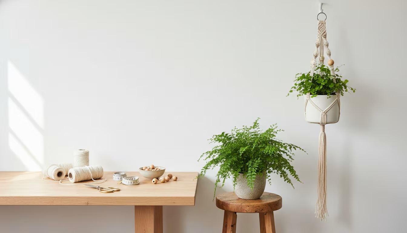
Making a small living room feel larger is usually treated as an adding problem: more mirrors, lighter paint, cleverer storage. The more effective lever is subtraction. Negative space, the deliberate empty area around and between your furniture and objects, is what lets a room breathe and read as more open than its square footage suggests. This is a design principle you can apply today without buying anything, just by editing and rearranging what you already own.
What Negative Space Actually Is
Negative space is the intentional absence of stuff: the clear floor, the empty wall sections, the unused surface of a coffee table. Your furniture, plants, and framed photos are the positive space; the quiet areas around them are the negative space that makes the positive space register. It is not the same as a bare, sterile room. The aim is balance, giving the eye somewhere to rest and a path to follow, so the objects you keep feel deliberate rather than crowded.
The framed-art comparison makes it concrete. In a painting, the image is the positive space and the mat and frame are the negative space; strip the border and the artwork feels cramped and loses impact. A living room works the same way. A vase or a vintage clock surrounded by a dozen other things barely registers, but give it clear space and it becomes a focal point.
Why It Makes a Room Feel Larger
Empty area lets light travel farther, creates a sense of depth, and removes the visual noise that reads as crowding. When roughly a third of your surfaces stay clear, the eye can move through the room instead of stalling on clutter, and that perceived flow is what makes a space feel bigger than its measurements. The effect is strongest in genuinely small rooms, where every inch of breathing room is magnified. It also happens to be free, which is more than can be said for most small-space fixes.
How to Create It
You do not need to throw everything out. The work is being deliberate about what you keep and how it is arranged.
1. Run a declutter audit. Take everything off your coffee table, end tables, and shelves, and pull out smaller furniture pieces. For each item ask whether it truly earns its spot or just landed there. You cannot see the negative space while it is buried.
2. Define zones. Even a small room hosts different activities: watching TV, reading, talking with guests. Give each zone a little breathing room. A small rug can anchor a seating area, and the back of a sofa can separate a conversation spot from a walkway so activities do not bleed together visually.
3. Float furniture off the walls. Pushing everything flush against the walls often makes a room feel like a box. Pulling a sofa or armchair even a few inches out creates the perception of space behind it, which reads as depth and makes the room feel wider.
4. Use vertical space without overfilling it. Drawing the eye upward makes a room feel taller. Tall, slim bookshelves, curtains hung high, or one piece of vertical art all help, but leave gaps: aim to keep about a third of any shelf clear rather than stacking it full.
5. Choose fewer, larger pieces. Many small objects create visual clutter. One substantial piece of art reads calmer and more deliberate than a wall of 20 small frames, and a single large plant in a good pot has more presence than three small trinkets.
6. Work with light and reflection. Keep windows unobstructed and skip heavy dark curtains, since light naturally expands a space. A large mirror placed opposite a window bounces light and doubles the perceived depth. Glass-top tables and acrylic chairs add openness because they do not block the sightline, but one well-placed mirror beats a scattering of small ones.
7. Apply the one-third rule to surfaces. When styling any flat surface, keep about a third of it clear. On a coffee table, that might mean a stack of books and a candle and nothing more. The empty portion gives the eye a rest and makes the displayed items feel intentional.
8. Run the shuffle test. After rearranging, live with the room for a day, then remove one item from each surface or zone, an extra throw pillow, a spare coaster, one figurine, and set it aside. Live with it another day. You rarely miss the removed piece, and the room feels lighter. It is an iterative process, not a one-time reset.
Common Pitfalls to Avoid
The biggest obstacle is the fear of empty. We are conditioned to read empty surfaces as unfinished or cold, but empty means calm, not boring; it gives your favorite pieces room to stand out. The second trap is sentimental overload, keeping every trinket and gift out of obligation until surfaces fill again. Rotate collections instead of displaying all of them at once. The third is ignoring traffic flow: if you have to squeeze past a chair to reach the sofa, the negative space is not working. Keep clear, unobstructed paths through the room. To avoid all three, start small, apply the one-third rule to a single surface, and set a simple boundary that something leaves whenever something new comes in.
Frequently Asked Questions
Is this just minimalism by another name?
No. Negative space is about balance and visual flow, not starkness. A cozy, eclectic, or vibrant room can use it effectively; it simply makes your collections look curated rather than chaotic.
Where should I begin if I have a lot of stuff?
Pick the smallest cluttered area, an end table, a shelf section, or the floor beside the couch. Clear it completely, then return only what belongs, leaving breathing room. Many people start with an entryway table because it shapes the first impression of the home.
What if my room is genuinely tiny?
The principle matters even more. Focus on floating furniture, tall and slim vertical pieces, reflective surfaces, and clear flat surfaces. Multipurpose furniture like a storage ottoman or nesting tables lets you tuck items away and expand surfaces only when needed.
Can I still display my thrift-store finds?
Yes, just be intentional about how. Rather than showing everything at once, rotate your collection and give current favorites a dedicated feature shelf surrounded by empty space, where they read as more impressive.
Pick one thing to try right now: clear a single surface to the one-third rule, or pull one piece of furniture an inch off the wall, and notice how the room reads afterward. Once the calmer result is visible, the harder decisions about what to keep get easier. The same editing instinct carries over to styling your bookshelves.
The editing rules, quantified:
| Rule | Number | Why it works |
|---|---|---|
| Clear surfaces | keep roughly 1/3 empty | the eye moves instead of stalling |
| Shelves | about 1/3 of each shelf clear | vertical space without overfilling |
| Float furniture | a few inches off the wall | space behind reads as depth |
| Fewer, larger | one substantial piece over 20 small frames | calm beats clutter |
| Zones | small rug anchors each activity | watching, reading, talking stay distinct |
Related Posts
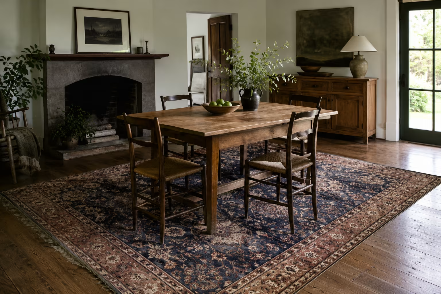
Area Rug Size Under Dining Table
A rug too small under dining table looks like a mistake. Chairs must stay on rug when pulled out.

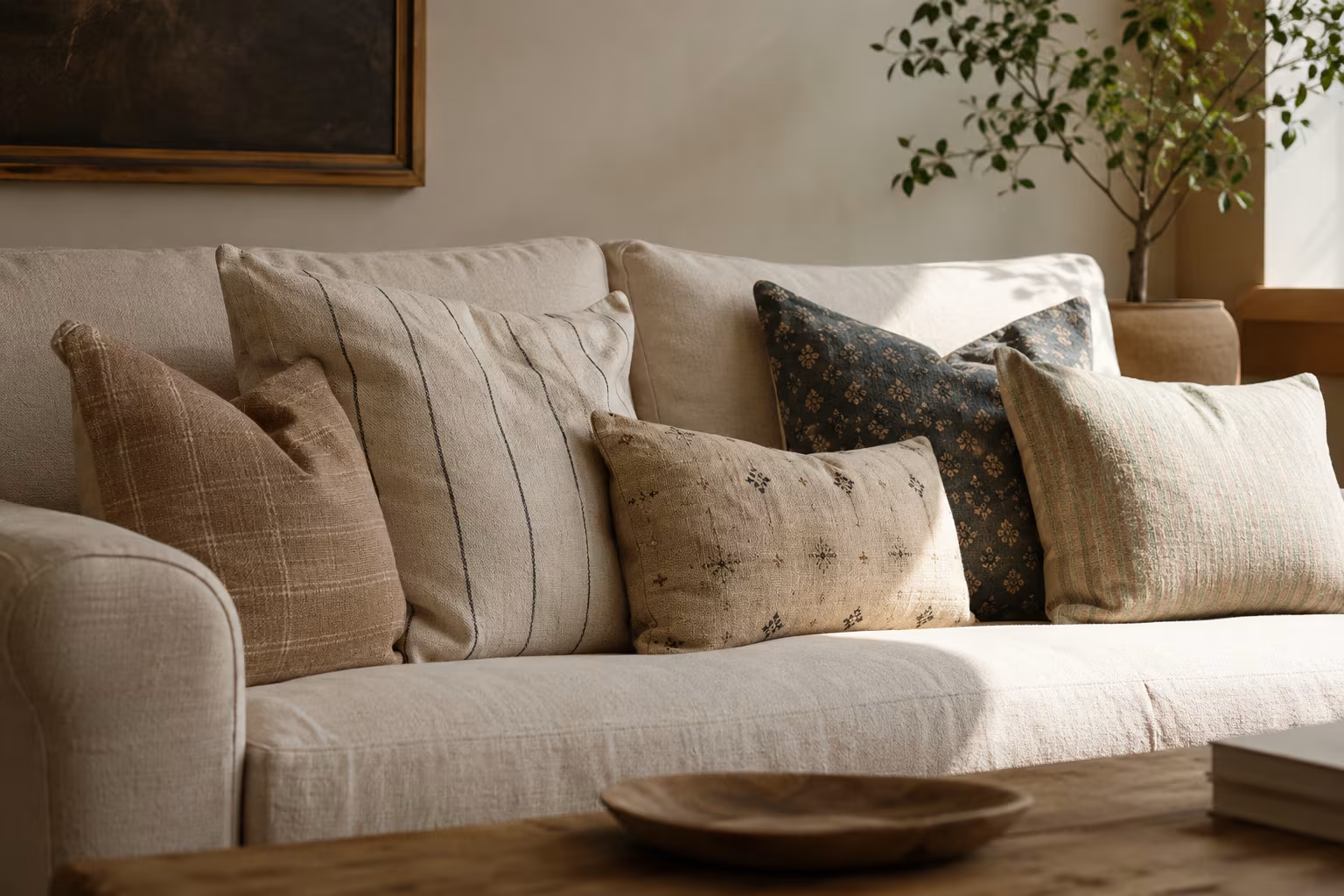
Sofa Pillow Combinations That Don't Fight
Throw pillows pile up over years. Rules for color, texture, pattern, and size.
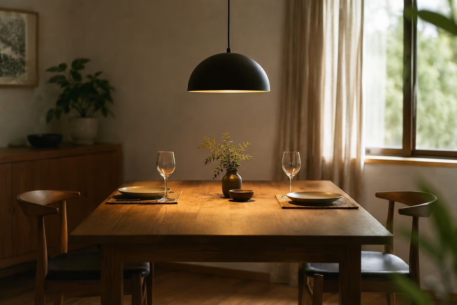
Light Fixture Height Over Dining Table: The Rule
The right pendant light height over a dining table is calculated, not guessed. The standard...
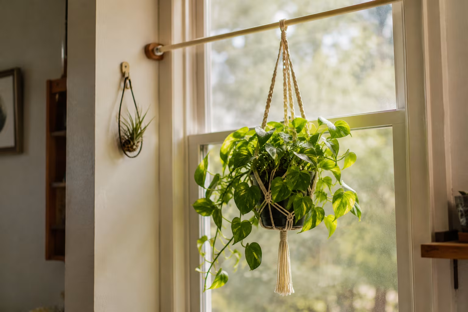
Hanging Plants Without Ceiling Hooks for Renters
Hanging plants brighten any room but drilling into the ceiling isn't always an option....
Comments
No comments yet. Be the first to share your thoughts!