How to Choose a Minimalist Color Palette That Doesn't Feel Cold
How to Choose a Minimalist Color Palette That Doesn't Feel Cold
Hey there, fellow makers! You know that feeling when you scroll through Pinterest, admiring those perfectly serene, clutter-free spaces? Everything looks so calm, so intentional. You think, "Yes, that's what I want!"
Then you try to recreate it in your own home or project, and suddenly your "minimalist" vision ends up looking more like a sterile doctor's office or a slightly sad, empty room. Sound familiar? I've definitely been there.
It's a common trap when you're aiming for a minimalist look – you strip away the bright colors, simplify everything, and accidentally create a space that feels utterly devoid of warmth and personality. It's tough!
Today, we're going to talk about how to choose a color palette that brings that serene, minimalist vibe without making you feel like you're living in an ice cube. We'll dive into what actually makes a color palette feel "cold," how to pick shades that keep things cozy, and some real-life tips I've learned from my own trial-and-error.
Why This Actually Matters
You might be thinking, "It's just colors, Laura. Does it really matter that much?" And I get it! For a long time, I thought a minimalist palette just meant white, white, and more white.
But here's the thing: the colors in your space – whether it's your living room, your craft nook, or even a small project like a painted wooden box – totally change how you feel when you're interacting with it.
A well-chosen palette creates a sense of peace and clarity. It helps reduce visual noise, which can seriously cut down on mental clutter too. Think about it: when everything "goes" together, your brain isn't constantly trying to categorize jarring elements.
I remember trying to organize my overflowing craft supplies in my garage workshop a few years ago. I painted all my new shelves stark white, thinking it would look clean and minimalist. Instead, with all the exposed tools and materials, it just looked clinical and a bit overwhelming.
It wasn't until I added some natural wood tones, a few woven baskets, and a small area rug in a muted green that the whole space started to feel inviting, even with all my tools out. It made a huge difference in how much I actually wanted to be in there creating.
What Even is a "minimalist" Palette?
First things first, let's clear up some confusion. When we say "minimalist color palette," we're not just talking about black and white. That's a common misconception, and it's probably why so many attempts end up feeling cold.
A truly minimalist palette is more about intentionality and restraint than it is about specific colors. It means choosing a limited number of colors – usually three to five – and sticking to them. It's about letting those chosen colors, and the textures that go with them, really shine.
The goal is to create harmony and a sense of calm, not to strip away all visual interest. It's about making thoughtful choices so everything feels cohesive and considered.
The "cold" Culprits: What Makes a Palette Feel Uninviting?
So, what exactly makes a minimalist palette lean towards "cold" rather than "calm"? It's usually a combination of factors, and often it comes down to undertones.
- Too many cool undertones: Blues, grays, and whites with strong blue or purple undertones can feel really crisp, but if they're not balanced with warmer elements, they can also feel icy.
- Lack of natural textures: Smooth, glossy, man-made materials without any wood, linen, or woven elements can create a sterile environment.
- Absence of contrasting warmth: Even in a cool palette, you need something – even a small accent – to provide a sense of groundedness or coziness.
- Stark bright white: While clean, a pure, bright white without any softer creams or grays can feel harsh, especially under certain lighting.
It's not that these elements are bad on their own! A cool gray wall can be stunning. But when everything in a space or project leans too heavily into them without counterbalance, that's when you hit the "cold" zone.
How to Actually do It: Building Your Warm Minimalist Palette
Okay, enough with the theory. Let's get into the practical steps. This is how I approach my own projects, from painting a thrift store dresser to planning the colors for a new series of paper crafts.
Step 1: Start with Your Core Feeling
Before you pick a single color, close your eyes and imagine the feeling you want this space or project to evoke. Do you want it to feel earthy and grounded? Light and airy? Cozy and comforting? Serene and peaceful?
This "feeling" is your guiding star. If you want earthy, you're probably leaning towards warmer, muted tones. If you want light and airy, maybe softer creams and barely-there blues. This step keeps you from just picking colors you like in isolation.
For example, my goal for my reading nook was "cozy and quiet." That immediately told me that stark white walls were out, and I needed to bring in softer, perhaps slightly darker, tones.
Step 2: Choose Your Hero Neutral (and Its Undertone!)
Every minimalist palette needs a hero neutral. This is your base, your canvas. It could be white, gray, beige, or even a very light greige (that's gray + beige).
The absolute most important thing here is its undertone. This is where people often go wrong. A white isn't just "white." It can have warm undertones (yellow, pink, red) or cool undertones (blue, green, purple).
If you want to avoid coldness, lean towards neutrals with warm undertones. Think creamy whites, off-whites with a hint of beige, grays with a brown or green tint, or true beiges.
Go to the paint store and grab a bunch of swatches. Put them against a pure white sheet of paper. You'll suddenly see how "white" actually has a secret color lurking underneath!
Step 3: Introduce Your 1-2 Gentle Accent Colors
Once you have your hero neutral, it's time for accents. Remember, we're aiming for gentle accents, not loud pops of color. Think about colors found in nature – they're often muted and harmonious.
I usually recommend picking one or two accent colors, maximum. And make sure they also have warm or balanced undertones. Some of my favorites that feel minimalist but not cold are:
- Sage Green: Earthy, calming, looks great with warm grays and creams.
- Dusty Rose/Terracotta: Brings a touch of warmth and subtle femininity, not overly bright.
- Muted Blue/Denim Blue: Can be cool, but a slightly desaturated, warmer blue can feel very inviting.
- Soft Peach/Apricot: A delicate hint of warmth without being too "colorful."
- Warm Wood Tones: Not a paint color, but incorporating natural wood is like adding an accent color.
Imagine your chosen accent color alongside your hero neutral. Do they play nice? Do they create the "feeling" you decided on in Step 1?
Step 4: Layer in Textures – This is Key!
This step is probably the most powerful trick to keep a minimalist palette from feeling cold. Texture adds visual interest and warmth without adding more colors. It's like adding cozy layers to an outfit.
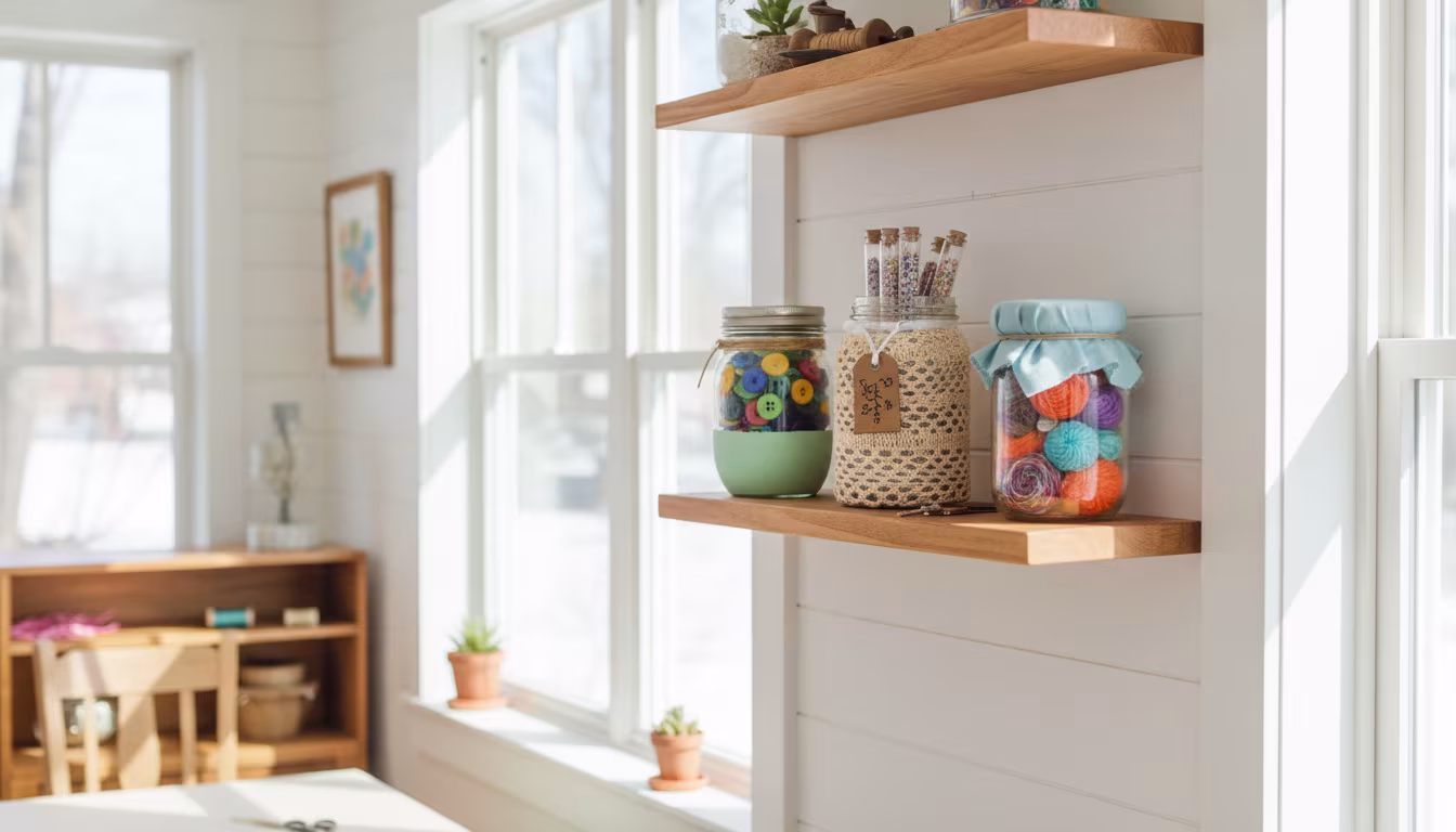
Think about natural materials: a chunky knit throw, a linen curtain, a jute rug, a wooden frame, a ceramic vase with a matte finish. Even a textured wallpaper in a neutral shade can do wonders.
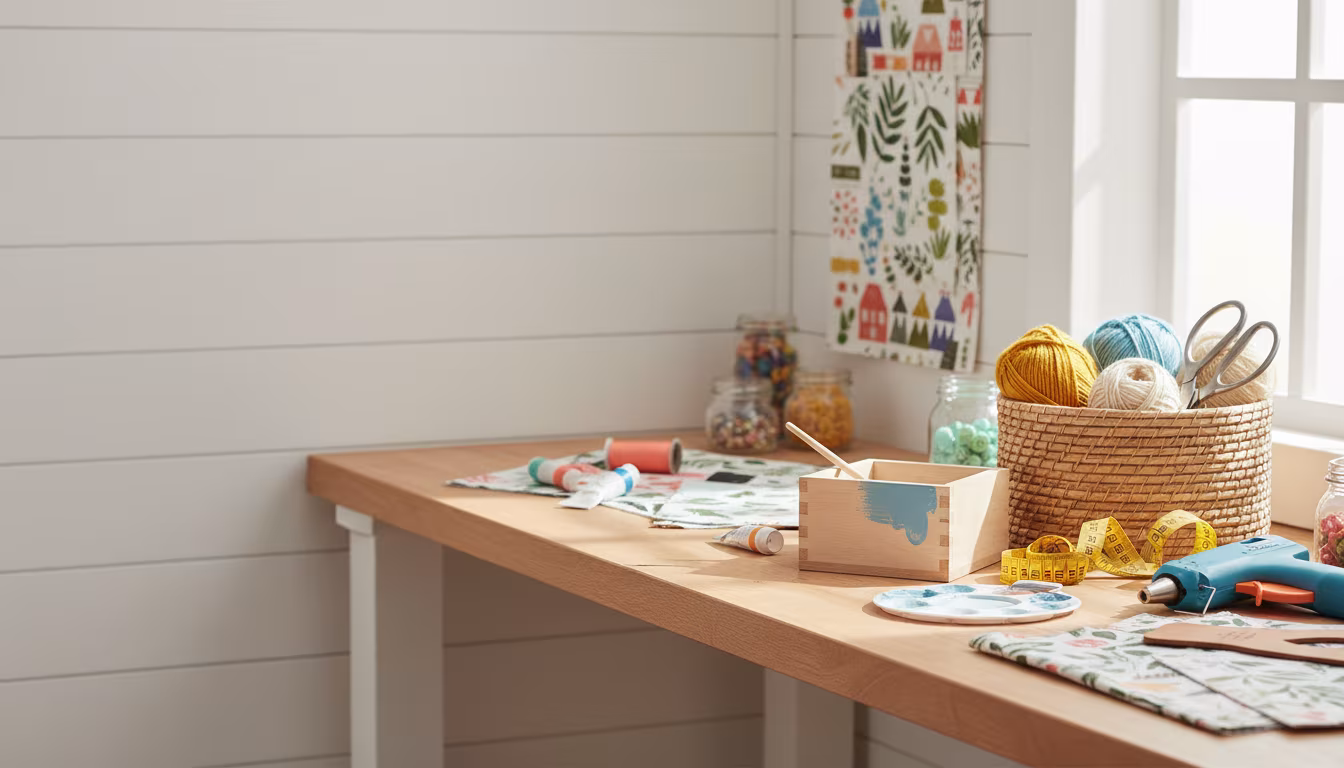
I can't tell you how many times I've finished a woodworking project, painted it a beautiful gray, and thought, "Hmm, something's missing." Then I sand it to a satin finish, add some leather pull handles, or set it on a woven mat, and suddenly it's exactly right.
Don't just think about smooth, flat surfaces. Embrace the tactile! This is where your thrift store finds really shine. A $5 rattan basket can bring more warmth than an expensive painting.
Step 5: Embrace Negative Space and Thoughtful Objects
Minimalism isn't just about the colors; it's about what you don't include. Negative space (empty areas) is just as important as the items you display. It allows your chosen palette and textures to breathe.
When you do add objects, make them intentional. A single, beautiful ceramic piece, a small plant, a stack of books with complementary covers. These become small focal points, adding personality without clutter.
I used to fill every shelf corner with something. Now, I'll put one meaningful object there, like a handmade pottery mug I got from a local artist, and leave the rest open. It makes that one object stand out, and the whole space feels calmer.
Step 6: Test, Test, Test (and Don't be Afraid to Adjust)
This isn't a "set it and forget it" process. Before committing to painting a whole room or buying a ton of fabric, create a mood board. Grab physical swatches, photos, and fabric samples.
If you're painting, buy small sample pots! Paint a decent-sized swatch on your wall and observe it at different times of day. Light changes everything. A warm white can suddenly look slightly green in the evening if your room faces north.
I once painted a whole cabinet what I thought was a soft, warm gray. In my garage, under fluorescent lights, it looked perfect. But when I brought it inside, in my living room with natural light, it suddenly looked like a battleship gray. Oops! I had to repaint it, and that wasn't fun. Learn from my mistakes!
Making It Stick / Common Mistakes
It's easy to get excited and then accidentally fall back into old habits. Here are a few common pitfalls I've seen (and made myself!):
Mistake 1: Relying Only on Pure Black and White
While black and white can be minimalist, it's the hardest combo to make feel truly warm. It requires a lot of texture, natural elements, and very careful lighting to avoid feeling harsh. Try off-whites, charcoals, or deep espresso browns instead of stark black, and creamy whites instead of pure brilliant white.
Mistake 2: Ignoring the Importance of Lighting
We touched on this, but it's worth repeating. Lighting plays a HUGE role in how colors appear. Warm-toned light bulbs (lower Kelvin numbers, often labeled "soft white" or "warm white") will instantly make any space feel cozier than cool-toned LED lights.
Natural light is also key. If your room gets a lot of cool northern light, you might need to lean even warmer with your paint choices to compensate.
Mistake 3: Forgetting the Ceiling and Floor
These are massive surfaces! Don't just default to plain white ceilings or ignore your flooring. A slightly off-white ceiling can soften a room. Natural wood floors or a large rug in your chosen palette are powerful tools for warmth and cohesion.
"A truly warm minimalist space isn't about the absence of color; it's about the intentional presence of thoughtful color and abundant texture."
Mistake 4: Too Many Competing Wood Tones
If you're using wood for warmth (which you should!), try to stick to one or two complementary tones. Mixing too many different types of wood with wildly different undertones (e.g., cool gray wood with very red cherry wood) can create visual chaos rather than calm.
My kitchen has oak cabinets and I tried to bring in a cooler, whitewashed wood for a cutting board. It just didn't work. Now I stick to warm, slightly darker woods to complement the oak.
Frequently Asked Questions
Can I Use Bright Colors at All in a Minimalist Palette?
You definitely can, but very sparingly and intentionally. Think of it as a tiny, focused burst – like a single vibrant flower in a neutral vase, or one small piece of art. It should be an accent, not a dominant feature, and often it helps if even that bright color is slightly desaturated.
Is Pure White Always Cold? How do I Make It Feel Warm?
No, pure white isn't always cold! To make it warm, focus heavily on textures – lots of wood, natural fibers, soft textiles. Use warm-toned lighting. Introduce just one or two accent colors with warm undertones, and ensure any furniture or decor elements bring in that essential warmth.
How Many Colors Should I Aim for in My Palette?
For a truly minimalist yet warm palette, I'd aim for 3-5 colors max, including your hero neutral. That usually breaks down to 1 primary neutral (like a creamy white), 1 secondary neutral (like a warm greige or a natural wood tone), and 1-3 gentle accent colors (like sage green or dusty rose).
What's the Difference Between "cold" and "clean" when It Comes to Design?
"Clean" usually implies fresh, uncluttered, and often light-filled. A space can be clean and still feel incredibly warm and inviting! "Cold," on the other hand, implies sterile, stark, and unwelcoming – lacking that human element. The goal is always clean and warm, not clean and cold.
Can I Achieve a Warm Minimalist Look on a Tight Budget?
Absolutely! This is where my love for thrifting comes in. Look for natural wood furniture that you can refinish. Seek out woven baskets, ceramic pieces, and linen textiles at second-hand stores. Even painting a small piece of furniture in a warm neutral can transform a corner. Paint samples are your best friend for trying out colors without a big commitment.
The Bottom Line
Creating a minimalist color palette that feels genuinely warm isn't about completely avoiding certain colors. It's about being thoughtful with your choices, understanding undertones, and leaning heavily on the power of natural textures.
Start small! Pick one corner of a room, or even just one craft project, and try applying these principles. You might be surprised how a simple shift in a neutral, or adding a woven element, can transform the entire vibe. Happy making! 👋
Related Posts
Why Ceramic Vase Collections Create More Impact Than Single Pieces
Ready to ditch single-use plastic wrap for good? Learn how simple it is to craft your own reusabl...
How to Style a Bar Cart That Doubles as Functional Home Decor
Got a collection of empty jars? Don't toss them! Learn how to turn those everyday items into amaz...
The Best Indoor Plants for Every Room Based on Light Conditions
Ready to dive into the world of DIY but not sure where to start? This guide is packed with simple...
Why Matte Black Hardware Transforms Basic Furniture Instantly
Dreaming of custom storage but think woodworking is too hard? Think again! We've broken down how ...